Commercial Trends Data
You can use the Commercial Trends section to see what your paying customers are doing. The Commercial Trends information represents the end user journeys defined in the Customer section of your feature rules.
The metrics displayed in the Commercial Trends section cover the following information:
- A summary of your total subscribers
- New Subscribers Over Time
This shows how many people have subscribed to your products in the last 90 days. These products have usually been granted when the end user purchases a subscription using a third-party payment provider, such as Braintree or Stripe.
For further information on the information provided in this section, see the New Subscribers Over Time section below.
- Churn rate
This shows the rate at which you have lost subscribers over time.
For further information on the information provided in this section, see the Churn Rate section below.
- Top Products
This shows how your top ten products have performed over the last 90 days. Any other products are grouped and categorised as Other.
For further information on the information provided in this section, see the Top Products section below.
New Subscribers Over Time
By default, the New Subscribers Over Time section shows your new subscriptions over the last 90 days.
You can also use this section to compare data year-on-year. This means that you can examine the seasonal trends in the subscription patterns and how your business grew this year compared to last year.
You can focus on a specific period by dragging the ends of the slider beneath the graph, as illustrated below:

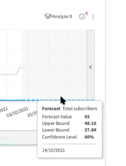
When the date axis becomes a dotted line, the data shows a forecast for the next 30 days. The forecast is based on your current subscriber trajectory and assumes that you have not changed anything in your set up, such as changes to rules or starting a new campaign. If you hover over this area, you can see the following information based on your data and the date that the forecast covers:
- Forecast value
The forecast value shows the forecasted number of subscribers for the forecast period based on your current data.
- Upper bound
The upper bound shows the highest number of subscribers that you can expect to gain during the forecast period based on your current data.
- Lower bound
The lower bound shows the lowest number of subscribers that you can expect to gain during the forecast period based on your current data.
- Confidence level
The confidence level
For example, in the following illustration, the forecast predicts that the company will have 43 subscribers on the 14th October, with an upper bound of 48 customers and a lower bound of 37 customers and a confidence level of 80%:
You can use this data to project how your subscription growth is likely to move over time. This information can then be used to adjust your user journeys and product offerings to maximise your subscriptions.
Churn Rate
The churn rate is calculated using an industry-standard calculation, as shown below:
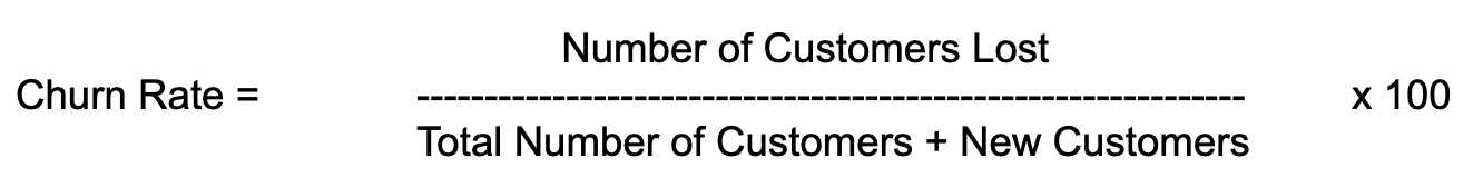
As this shows, the number of customers you lost over the period is divided by the total number of customers you had, plus any new customers you gained in the same period. The result of this calculation is multiplied by 100 to provide the percentage of users that were lost in the period.
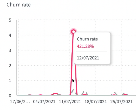
The graph also shows the running average over time. We provide this information as large spikes in your churn rate do not necessarily give a true reflection of the state of the business, as shown in the following illustration:
You can also see the year-on-year analysis of your churn rate in the graph.
You can focus on a specific period by dragging the ends of the slider beneath the graph, as illustrated below:
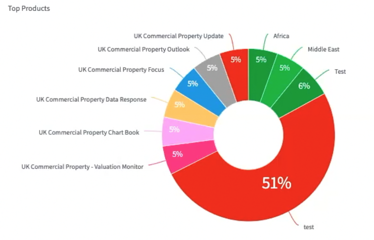
Top Products
The Top Products graph shows the top ten products that were granted most frequently over the last 90 days. Products that have been granted in this period, but are not part of the top ten, are grouped in the graph under Other.
You can use the graph to understand which products are most popular. You can also use it to predict trends and create offers that might convert registered users into customers.
The following example graph illustrates how the top products are reported: