Create a Login, Registration or Forgot Password Form
To create a login, registration or forgot password form, complete the following steps:
- Select the Add button under the Form heading
The Form Details screen displays, as illustrated below:
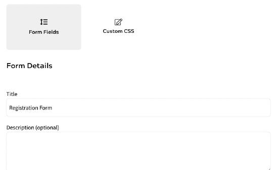
By default, the Registration radio button is selected and the Title text box is pre-filled with Registration Form. You can edit this if required.
You can configure login, registration and forgot password forms from this screen.
- If you want to allow end users that are associated with a Company Account to enter a code, select the Allow Registration Codes for Account Membership checkbox
This adds a field to your registration form that can be used by end users who have been given an access code for a Corporate Account. For further information on managing Corporate Accounts, see the Companies and Accounts topic.
- If you want to allow end users to authenticate using a verification link that is sent to the specified email address, select the Use Passwordless Authentication checkbox
Note: This checkbox is only available if you have enabled email verification. For further information on passwordless authentication and enabling email verification, see the Passwordless Authentication topic.
- Define the fields for Account Verification step in your form. The fields used in the Account Verification step are as follows:
- Text
This defines the introductory text displayed on your form.
To edit the text displayed, complete the following steps:
- Select the three dots at the end of the row
- Select Edit
The Text dialog box displays, as illustrated below:
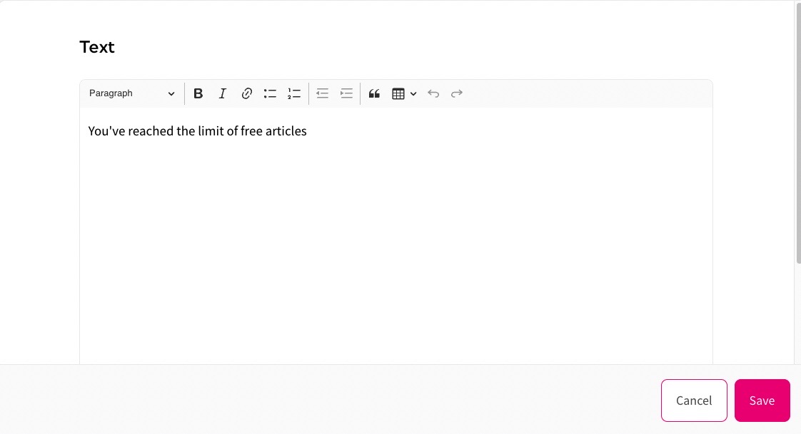
- Enter the text you want to display in the text box
Note: If you want to format the text, for example to include a heading or a list, use the formatting bar at the top of the text box.
- Select the Save button to save your changes and return to the Form Details screen. Selecting the Cancel button displays the Form Details screen without saving any changes
- Email Address
This displays a field in which the end user can enter their email address
To edit the text displayed, complete the following steps:
- Select the three dots at the end of the row
- Select Edit
The Enter Email Address dialog box displays, as illustrated below:
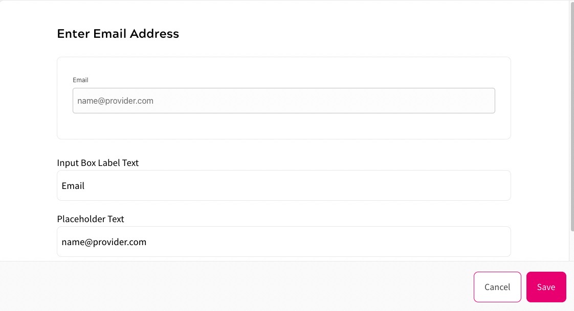
At the top of the Enter Email Address dialog box, you can see a representation of the email address field as it appears in your form.
- Enter the label you want to display above the email address field in your form in the Input Box Label Text text box
- Enter the text you want to display in the email address field in your form in the Placeholder Text text box
- Select the Save button to save your changes and return to the Form Details screen. Selecting the Cancel button displays the Form Details screen without saving any changes
- Account Code
Note: This option is only present if you selected the Allow Registration Codes for Account Membership checkbox.
This displays a field in which the end user can enter their account registration code.
To edit the text displayed and any placeholder text, complete the following steps:
- Select the three dots at the end of the row
- Select Edit
The Account Registration Code dialog box displays, as illustrated below:
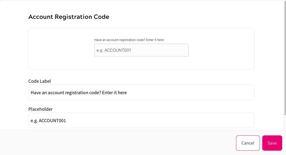
At the top of the Account Registration Code dialog box, you can see a representation of the account registration code field as it appears in your form.
- Enter the label you want to display above the account registration code field in your form in the Code Label text box
- Enter the text you want to display in the account registration code field in your form in the Placeholder text box
- Select the Save button to save your changes and return to the Form Details screen. Selecting the Cancel button displays the Form Details screen without saving any changes
- Button (Continue)
This displays the Continue button, which your end user can use to move to the next step in the form
You can edit the colour of your button using the Style Guide. For further information on defining your style guide, see the Define Your Style Guide topic.
To define the text used on the button, complete the following steps:
- Select the three dots at the end of the row
- Select Edit
The Button dialog box displays, as illustrated below:
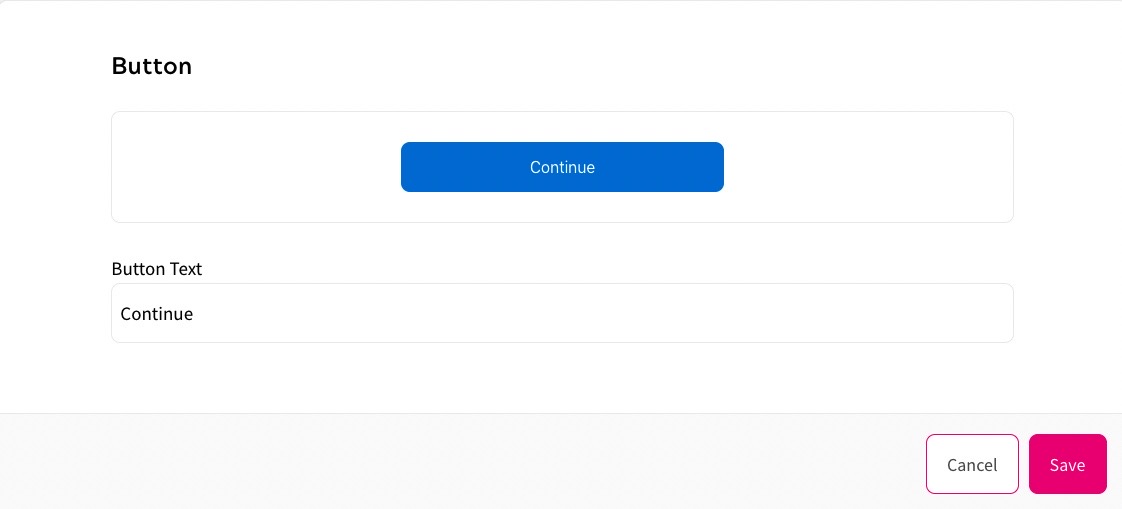
At the top of the Button dialog box, you can see a representation of the button as it appears in your form.
- Update the text in the Button Text text box
- Select the Save button to save your changes and return to the Form Details screen. Selecting the Cancel button displays the Form Details screen without saving any changes
- Divider
This defines the divider used in your form.
To define the divider, complete the following steps:
Select Edit
The Divider dialog box displays, as illustrated below:
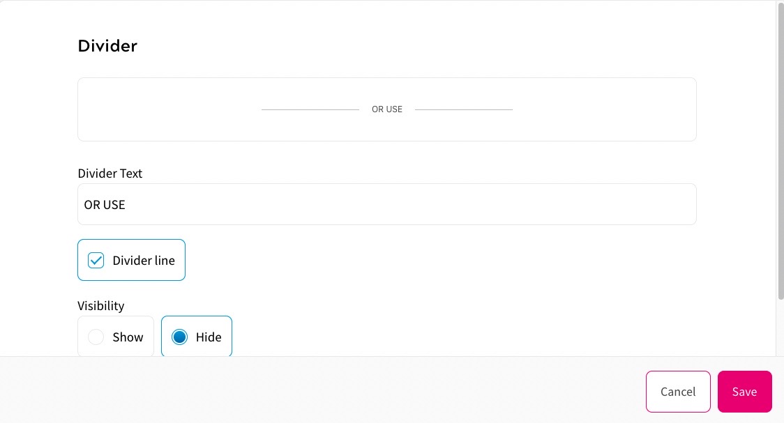
At the top of the Divider dialog box, you can see a representation of the divider as it appears in your form.
- Select the three dots at the end of the row
- Update the text in the Divider Text text box
- By default, the Divider line checkbox is selected. This displays a line either side of your defined text. To remove the lines, deselect the Divider line checkbox
- Select whether to display or hide the divider from the Visibility radio buttons. The options are as follows:
- Show
- Hide
- Select the Save button to save your changes and return to the Form Details screen. Selecting the Cancel button displays the Form Details screen without saving any changes
- Social Login
This defines the social login providers that your end user can use to verify their account.
When defined, the end user can select the logo of the social sign-on provider to register and login.
To define the social login providers, complete the following steps:
- Select the three dots at the end of the row
- Select Edit
If you have not already defined login providers, the Social Sign-in dialog box displays, as illustrated below:
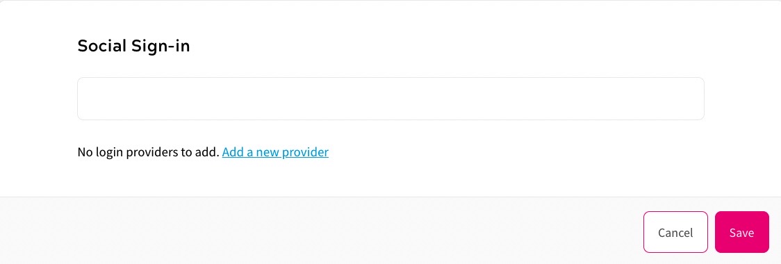
Select the Add a new provider link to select the login providers that can be used in your form. If you have connected a user attribute to a field name used by your login provider, the information is automatically completed in the form when your end user uses the login provider. For further information on defining login providers, see the Login Providers topic.
If you have defined login providers, the Social Sign-in dialog box displays as illustrated below:
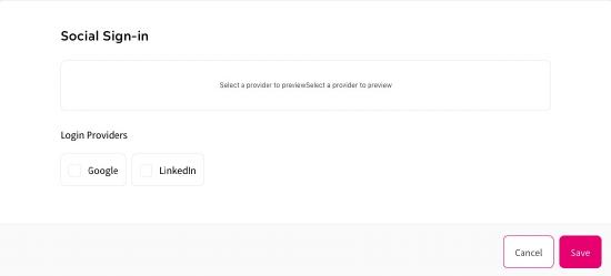
Select the checkbox for each login provider that you want to offer for use in your form.
At the top of the Social Sign-in dialog box, you can see a representation of the selected login providers as they appear in your form.
- Select the Save button to save your changes and return to the Form Details screen. Selecting the Cancel button displays the Form Details screen without saving any changes
- Text
- If you want to add custom text to your form, select the Add Custom Text button
The Text dialog box displays. Complete the dialog box as described for the Text field above.
- Define the forms that can be used as required. You can define the following forms:
- Login. For further information on defining the login form, see the Define a Login Form topic
- Registration. For further information on defining the registration form, see the Define a Registration Form topic
- Forgot Password. For further information on defining the forgot password form, see the Define a Forgot Password Form topic
- Select the Save button to save your changes and return to the Add an Outcome screen. Selecting the Cancel button displays the Add an Outcome screen without saving any changes