Component Library
You can create different types of components that can be reused in feature outcomes. After setting up the components in a central library, you and your team can easily add the templates to specific feature rules instead of manually creating similar components multiple times for different rules.
The following component types are available:
- External Component: Reference to external UI components that are based on HTML templates. See External Template for more information.
- Custom Component: Build up custom components from scratch. You can define variables in the component. A live preview window is available. See Custom Component for more information.
- Component Templates: Templates with predefined variables for specific components, such as footers. You can work out your own components based on the templates. See Component Template for more information.
- Registration and Data: Includes Login, Registration and Forgot Password Forms, Data Capture Forms, and Complete Registration Forms.
- Payment: See Payment Forms for more information.
- Subscription Change Form: See Subscription Change Forms for more information.
- Contact: See Contact for more information.
Create and manage components in Component Library
On the Component Library page, you can view the existing components. For example, a payment form component will be displayed as follows:
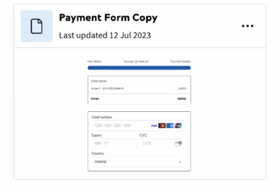
Components are listed by the last updated time. You can search for specific components using the search bar at the top of the page. For the form type components, each form type is represented by a fixed thumbnail, which means you cannot customise the thumbnail for a specific form component.
To create a component:
- Navigate to Delivery > Component Library.
- Click + Add Component.
- In the pop-up window, click select the type of the component to be created.
- Complete the required configurations for the selected component following the below tutorials:
- External Component
- Custom Component
- Component Template
- Data and Registration: Login, Registration and Forgot Password Forms, Data Capture Forms, and Complete Registration Forms
- Payment
- Subscription change forms
- Contact
Note: You can create a template component when adding a form or custom component block to an outcome. To do so, select Save & Add to Component Library when saving it.
You can create and manage the versions of a component:
- Click the component that you want to edit, or click More Action > Edit
- On the Component Details page, you can edit or delete a version, create new versions, or set a version as the default. You can add or modify the description of versions.
Tip: Use search to find a version quickly.
You can also clone or delete a component by clicking the More Action icon of the component and then clicking Delete or Clone.
Retrieve components as rendered HTML
Components configured in the Component Library can be retrieved as rendered HTML using the Public API. You can specify the version of a component that will be retrieved in the path.
Below is an example request:
https://{your-domain}/zephr/public/form-library/v1/library-forms/{formId:formVersion}
To retrieve version 1 of the form, you can specify the path parameter to payment-form:1. To reference the default version, use payment-form:active or just exclude any version number in the parameter, for example payment-form.
For more information about how to retrieve components, see the Component Library API reference.
Add components to the feature rules
When adding an outcome to a feature rule, you can use the components created in the Component Library.
Take the following steps to add a component from Component Library:
- On the Add an Outcome or Edit an Outcome page, click + Add A Component or Form under Components or a specific component section.
- Click Component Library under Components, and then select the component from the library.
- Give the component a title.
- Determine the version to be used. The default version will be automatically selected. To change to another version, turn off the Use Default Version toggle button, and then select the version to be used from the version list. Note that you can preview the component from the preview window on the right-hand side. The preview window supports switching between devices and specifying screen size.
- Update values for the variables defined for the component, if applicable.
- Click Save.
For more information about how to work with feature outcomes, see Feature Outcomes.