Add a Component
To add a component, complete the following steps:
- Select Delivery from the main menu
- Select Component Library from the menu options
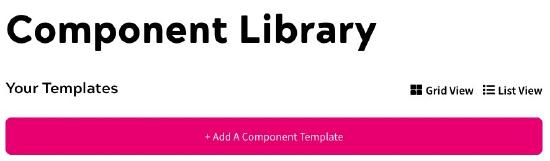
The Component Library screen displays, as illustrated below:
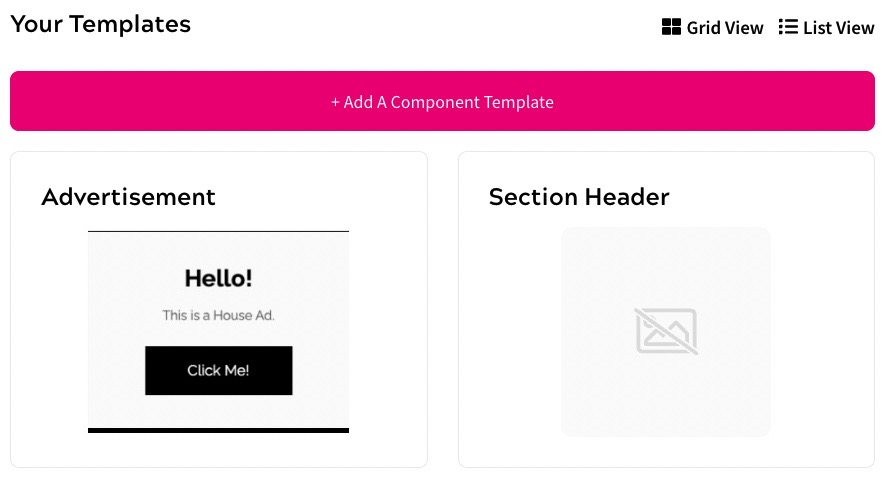
You can view the components that are used in your site as a grid or a list.
By default, your components are displayed using the Grid View. This displays a list of visual examples that provide a guide to the layout of each component, as illustrated below:
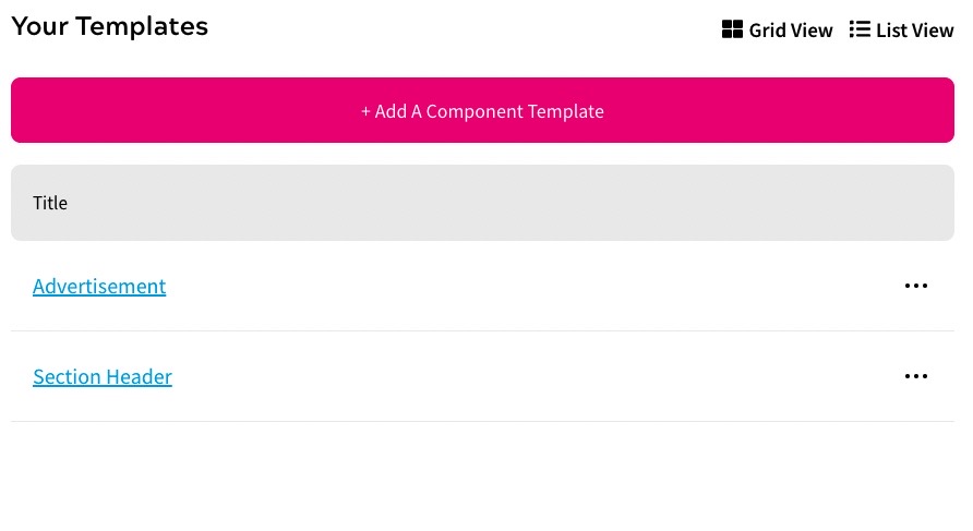
Select List View to display a list of your components, as illustrated below:
- Select the Add A Component Template button, and then click the + Add button under Component Template
The Add a Template screen displays, as illustrated below:
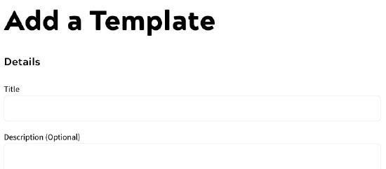
- Enter a name for the template in the Title text box
- Optionally, add a description of the template in the Description (Optional) text box
- Upload an image of your component, which can help you to visually identify the component to use in your feature outcome
To upload the image, you can do either of the following:
- Drag and drop the file into the Drop file here to upload field
- Select the Select a File To Upload button, navigate to your file and select it, then select Open
- Enter the address at which the component is hosted in the URL text box
- Select the Add A Variable button
The Add a Variable dialog box displays, as illustrated below:
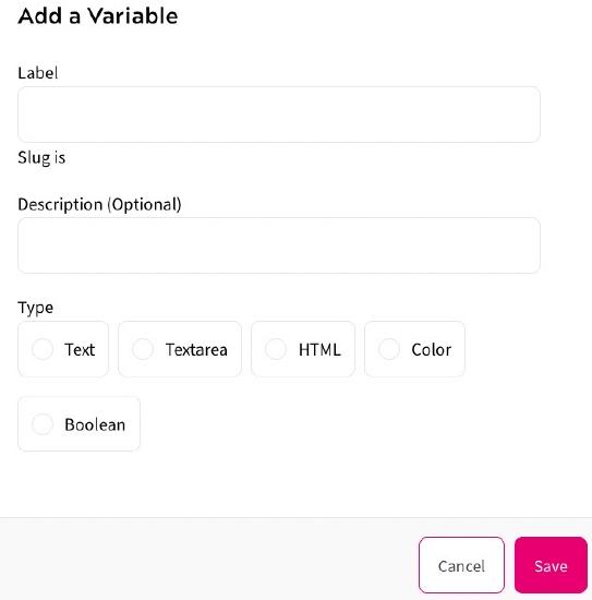
To add a variable, complete the following steps:
- Enter a name for the variable in the Label text box
- Optionally, enter a description of the variable in the Description (Optional) text box
- Select the type of content represented by the variable from the Type radio buttons. The options are as follows:
- Text
Select this to replace the variable with text, which can be entered in a text box in your outcome
- Textarea
Select this to replace the variable with a larger amount of text, which can be entered in a text box in your outcome
- HTML
Select this to replace the variable with a UI component that is defined using HTML
Note: Ensure that the supplied HTML is unescaped using triple braces. For example
{{{html content}}}. - Color
Select this to replace the variable with a colour, which can be selected in your outcome
- Boolean
Select this to replace the variable with a true/false decision, for example to turn sections of the template on or off
For example, if you have defined the show-more variable as a Boolean, the following component allows you define how to display more information:
                    Always shown
                    {{#show-more}}
                    Show if true!
                    {{/show-more}}
- Text
- Select the Save button to save your updates and return to the Add a Template screen. Selecting the Cancel button displays the Add a Template screen without saving any changes
Note: You can also preset variables directly in the template component, as described in the User Variables in Component Templates section.
- Select the Save button to add the template and return to the Component Library screen. Selecting the Cancel button displays the Component Library screen without adding a template
You can view the base-form of the component in a browser by navigating to the URL at which the component is hosted. The base form comprises the mustache variables used in the component, which are used to define what is included in the component. You defined these in step 8 above.
A mustache compiler ensures that the variables can be set in your feature. This means that a single component template can be used in multiple outcomes in your feature rules, as you define the values assigned to the variables when adding an outcome from your component library.
For further information on adding an outcome from your component library, see the Component Library Templates topic.
For further information on the syntax used, refer to the mustache specification.
User Variables in Component Templates
To do this, your template must includes the relevant variables to represent the data to display.
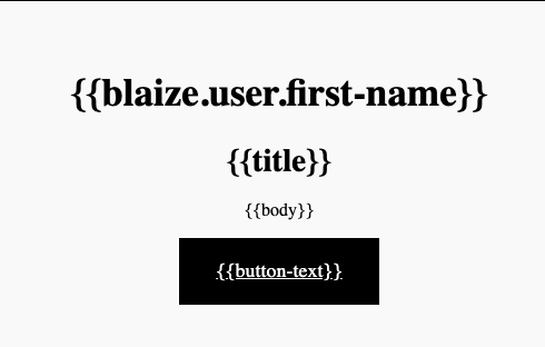
For example, the following template component presets the top variable to {{blaize.user.first-name}}:
Add your template to your Component Library.
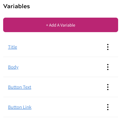
Note: You do not need to add the {{blaize.user.first-name}} variable when adding this template, as it is preset. You can still add other relevant variables. For example, in the example template above, we added the Title, Body, Button Text, and Button Link variables in the Admin Console, as illustrated below:
When you create an Outcome using the Component Library, as described in the Add an Outcome topic, you must set the values for these other variables. However, as we preset the {{blaize.user.first-name}} variable, it is already available and you do not need to define a value.
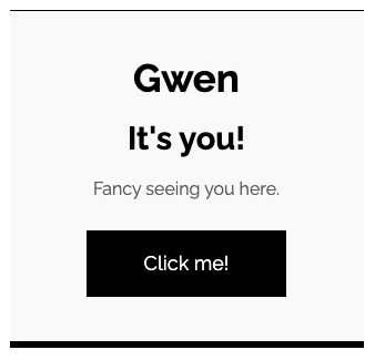
When published, your component template is run through a mustache compiler to replace the variables with your defined content. For example using the template component defined above, the end user’s first name, which is stored as Gwen, displays instead of the {{blaize.user.first-name}} variable as illustrated below:
By default, mustache variables are HTML escaped. You can use triple mustache syntax to inject rich text without escaping the HTML ASCII characters using the following format:
{{{unescapedVar}}}
For further information on what you can achieve using mustache variables, refer to the Mustache Manual.