Define the Payment Information
The Payment options screen allows you to define the following fields:
- Promo Codes: Enable promo codes, providing a field for end users to enter a code and receive a payment discount.
- Payment Details: Display the purchase summary and allow end users to submit their payment.
- Successful Payment: Display a success message post payment submission, and if shareable products are enabled, provide the link for inviting members along with any user attributes to include in the invitation.
After defining these forms, click the Done button to return to the Add Payment Form screen.
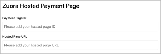
Zuora Hosted Payment Page
This section is displayed only when Zuora Billing is selected as the payment provider. Enter the payment page ID and hosted page URL.
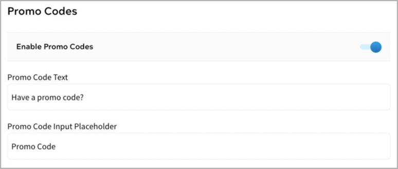
Promo Codes
This section appears when a payment provider other than Zuora Billing is selected. If you have set up Promo Codes for your payment provider to use in this payment form, select the Enable Promo Code toggle.
For information on setting up Promo Codes for your payment provider, see the Payments section.
To define the promo code fields, complete the following steps:
- Enter the label you want to display for the promo code step in the Promo Code Text text box. By default, this is pre-filled with Have a promo code?
- Enter the text you want to display in the promo code field in your form in the Input Box Placement Text text box. By default, this is pre-filled with Promo Code.
Payment Details
Enter the name for this step in the Title text box. By default, this is pre-filled with Payment Details. You can edit this if required.
The available fields for the payment details are as follows:
- Progress Bar
This allows you to show or hide the progress bar. By default, the progress bar is shown. To hide the progress bar, complete the following steps:
The headings used on the Progress Bar match the Title text entered in your sections.
- Select the three dots at the end of the row.
- Select Edit. The Progress Bar dialog box displays, as illustrated below:
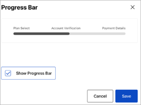
- Uncheck the Show Progress Bar box.
- Select the Save button to save your changes and return to the Registration screen. Selecting the Cancel button displays the Registration screen without saving any changes.
- Purchase Summary
This defines the summary text displayed at each step of your form. To edit the text displayed, complete the following steps:
- Select the three dots at the end of the row.
- Select Edit. The Purchase Summary dialog box displays, as illustrated below:
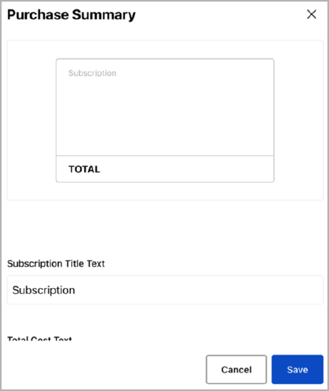
- Enter the title text you want to display in the Subscription Title Text text box.
- Enter the text you want to display in the total cost section in the Total Cost Text text box.
- Select the Save button to save your changes and return to the Payment screen.
- Card Details
This section is non-editable and showcases the fields where your end user can enter their card information for payment from the specified account.
- Apply Pay and Google Pay
Toggle to enable or disable payments through Apple Pay and Google Pay. By default, both options are disabled. To activate payments via Apple Pay and Google Pay, toggle the switch.
End users only see the relevant option based on their device and browser. For instance, if a user visits your site using Chrome, the Google Pay option will be displayed; if they visit from an iPhone, the Apple Pay option will be shown.
If you are using Stripe as your payment provider, refer to the following Stripe documentation for information on going live:
If using Braintree as your payment provider, refer to the following Braintree documentation for further information on going live:
- For Apple Pay, Verify your domain with Apple Pay
- For Google Pay, Going live with Google Pay
- For Apple Pay, Apple Pay
- For Google Pay, Go Live
- Button (Continue)
This displays the Confirm and process payment button, allowing your end user to complete the purchase. To customize the text used on the button, perform the following steps:
- Select the three dots at the end of the row.
- Select Edit. The Button dialog box displays, as illustrated below:
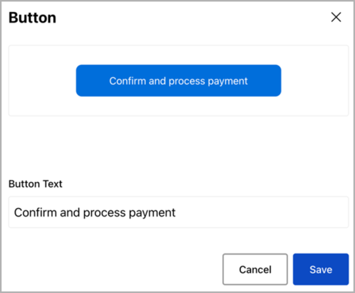
At the top of the Button dialog box, you can see a representation of the button as it appears in your form.
- Update the text in the Button Text text box.
- Select the Save button to save your changes and return to the Email Address screen.
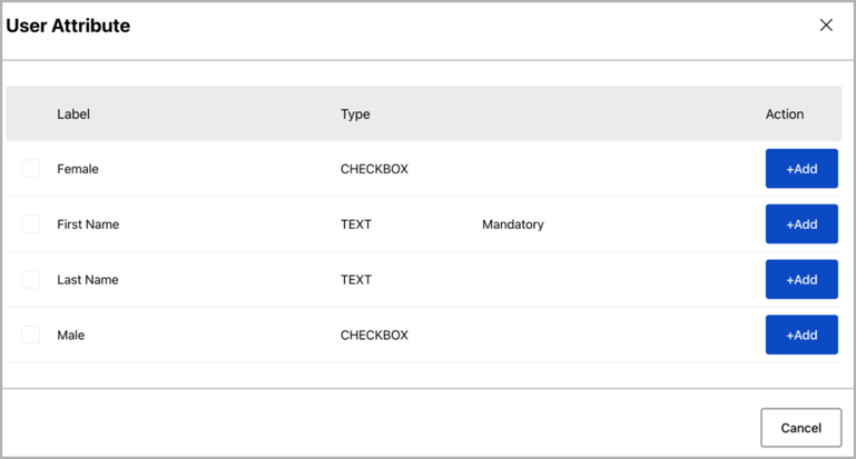
- Add User Attribute
This allows you to add a field of your choice to obtain further information from the end user.
Ensure you have defined user attributes for the fields you wish to add. For more details on user attributes, refer to the User Attributes topic.
To add a field of your choice:
- Click Add a User Attribute from the Payment screen. The User Attribute dialog box displays, as illustrated below:
-
To add a single field, select the Add button at the end of the row for the user attribute you want to add. The Registration screen will show the newly added field.
-
To add multiple fields, select the checkbox next to the user attributes you want to add, then select the Add Selected button. The Registration screen will show each user attribute as a field.
-
If you want a user attribute field to be mandatory in your registration form, toggle the Required switch at the end of the row for the relevant user attribute. To edit the display of a user attribute field in your create password form, complete the following steps:
-
Add the required user attribute field.
-
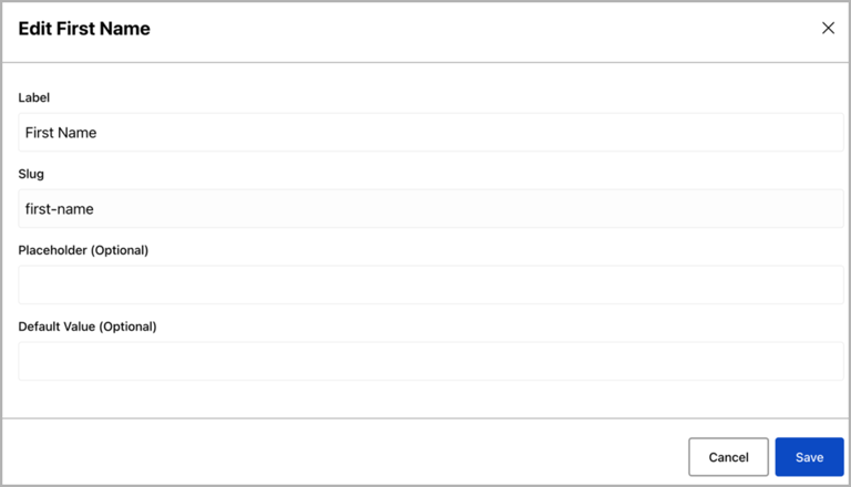
Click the three dots at the end of the row for the relevant field in the Payment Details screen.
- Click Edit. The Edit dialog box is displayed.

-
-
To add a single field, select the Add button at the end of the row for the user attribute you want to add. The Registration screen will show the newly added field.
-
To add multiple fields, select the checkbox next to the user attributes you want to add, then select the Add Selected button. The Registration screen will show each user attribute as a field.
-
If you want a user attribute field to be mandatory in your registration form, toggle the Required switch at the end of the row for the relevant user attribute.
-
-
To edit the display of a user attribute field in your create password form, complete the following steps:
-
Add the required user attribute field.
-
Click the three dots at the end of the row for the relevant field in the Payment Details screen.
- Click Edit. The Edit dialog box is displayed.
-
Edit the label displayed above the field in the Label text box. By default, this is pre-filled with the name of the user attribute.
-
If required, edit the text displayed in the field in the Place Holder (Optional) text box. By default, this is blank.
-
If required, edit the default value of the field in the Default Value (Optional) text box.
- Click Save to save your changes and return to the Registration screen.
For information on editing the user attribute, see the User Attributes topic.
-
- Add Custom Text
To include custom text in your form, select the Add Custom Text button. The Text dialog box is displayed.
To define the custom text, complete the following steps:
- Enter the text you want to display in the text box
Note: If you want to format the text, for example, to include a heading or a list, use the formatting bar at the top of the text box.
- Select the Save button to save your changes and return to the Email Address screen.
- Enter the text you want to display in the text box
- Add a Section
If required, select the Add A Section button to add a step to your registration form. By default, the new section contains the following fields:
-
Title
By default, the Title text box is pre-filled with New Section x. This is displayed on the progress bar. You can edit the text if required.
-
-
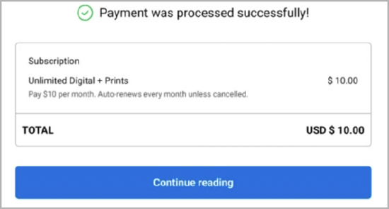
When you publish your feature, the payment details display on your site in a similar way to the following:
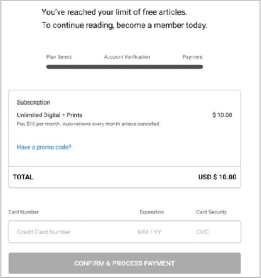
If using Stripe as the payment provider, the payment details page will not display external tax by default. If you need to display the tax information to your end users, contact our customer support team to enable this.
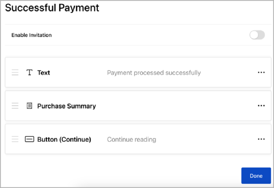
Successful Payment
If you have enabled shareable products, as described in the Create a Product topic, you can allow the customer to send invitations from the successful payment page. To do this, select the Enable Invitation toggle. Further fields display, as illustrated below:
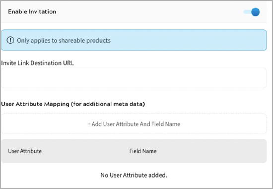
To define the destination URL for the link included in the invitation, enter the URL to display when the invitation link is selected in the Invite Link Destination URL text box.
To map a user attribute to an invitation field, complete the following steps:
- Select the Add User Attribute and Field Name button. The Attribute Mapping dialog box displays, as illustrated below:
- Select the user attribute to associate with the invitation field from the User Attribute drop-down menu.
For example, select the First Name user attribute to include the name of the person sending the invitation.
Note: You must create user attributes before you can map them to an invitation field. For further information on creating user attributes, see the Add a User Attribute topic.
- Enter the name of the invitation field in the Field Name text box.
- Select the Save button to save the mapping and return to the User Attribute Mapping screen. Selecting the Cancel button displays the User Attribute Mapping screen without adding any mappings.
The available fields for a successful payment are as follows:
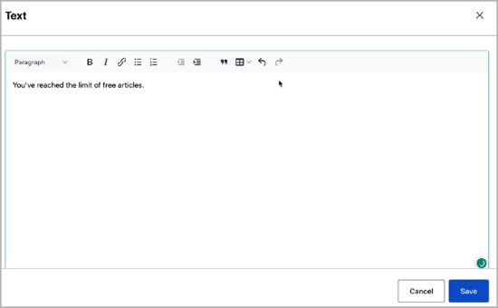
- Text
This defines the message text that displays following a successful payment.
To define the text, complete the following steps:
- Select the three dots at the end of the Text row.
- Select Edit.
The Text dialog box displays, as illustrated below:
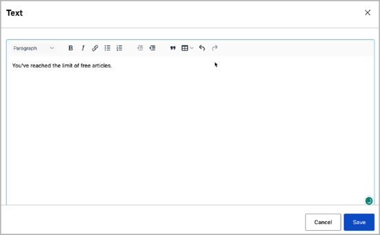
- Enter the text you want to display in the text box.
Note: If you want to format the text, for example, to include a heading or a list, use the formatting bar at the top of the text box.
- Select the Save button to save your changes and return to the Login screen.
You can remove this field as follows:
- Select the three dots at the end of the Text row.
- Select Delete. The field is deleted immediately.
- Purchase Summary
This defines the summary text displayed at each step of your form. To edit the text displayed, complete the following steps:
- Select the three dots at the end of the row.
- Select Edit. The Purchase Summary dialog box displays, as illustrated below:
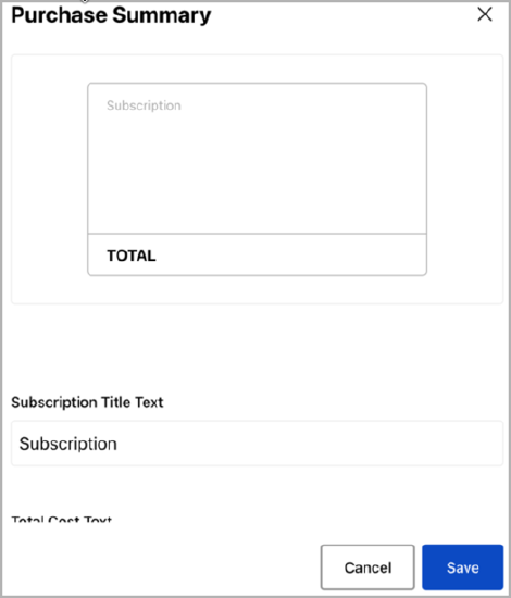
- Enter the title text you want to display in the Subscription Title Text text box.
- Enter the text you want to display in the total cost section in the Total Cost Text text box.
- Select the Save button to save your changes and return to the Payment screen.
- Invitation Details
This only displays if the Enable Invitation toggle is selected and defines the invitation displayed to allow the customer to invite members to join their shareable product. To define the wording for the invitation, complete the following steps:
- Select the three dots at the end of the row.
- Select Edit. The Invitation Details dialog box displays, as illustrated below:
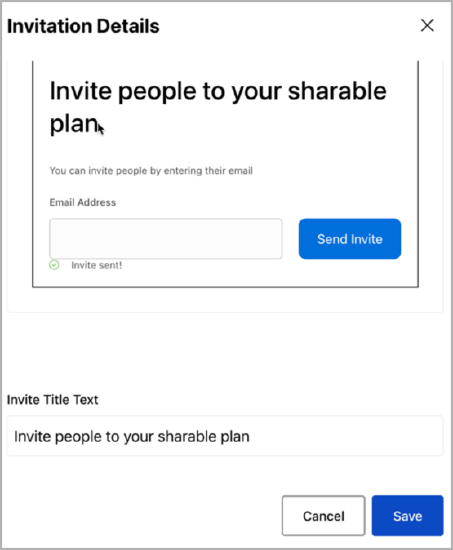
At the top of the Invitation Details dialog box, you can see a representation of the invitation fields as they appear in your form.
- Update the heading for the invitation in the Invite Title Text text box.
- Update the description of the section in the Invite Description Text text box.
- Update the label you want to display above the email address entry field in the Input Box Label Text text box.
- Update the text used on the button in the Button Text text box.
Note: By default, this button displays to the right of the email address entry field. If you want to change this positioning, use custom CSS to define how the form is displayed.
- Update the message displayed when an invitation is sent to an email address in the Link Sent Message text box.
- Select the Save button to save your changes and return to the Payment screen.
- Button (Continue)
This displays the Continue reading button, which your end user can use to move to the next step in the form. By default, this is pre-filled with Continue reading.
To define the text used on the button, complete the following steps:
- Select the three dots at the end of the row.
- Select Edit. The Button dialog box displays, as illustrated below:
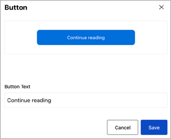
At the top of the Button dialog box, you can see a representation of the button as it appears in your form.
- Update the text in the Button Text text box.
- Select the Save button to save your changes and return to the Email Address screen.
When you publish your feature, the successful payment message displays on your site in a similar way to the following: