Configure User Interface
Customize the look and feel of the portal by using your company’s branding images and styles to help market your portal.
- Enter the installed Subscriber Portal instance and click the Look and Feel tab.
- In the Portal Branding Images section, upload your company logos and other brand marketing images to help identify your portal. Logos and marketing images are customer-facing and will be displayed in the portal as indicated by the listed name. The recommended size for each image is displayed, and modifications to images may be required.
- In the Override Default CSS section, edit or overwrite the default CSS to customize the portal with your branding. The aspects of the portal that can be customized include the size and shape of buttons, font style, color schemes of the headers and footers, and so on.
- To edit CSS, click Default CSS to review the default CSS and use it as a template for any desired modifications.
- To overwrite CSS, directly enter the desired CSS in the input box.
- In the Dashboard Configuration section, configure the cards of the end user’s dashboard. Cards are different sections of information in the dashboard, for example, the account balance, invoice information, and the default payment method of an account. Each portal has 8 pre-configured cards that can be edited and you can create additional cards. Pre-configured cards cannot be deleted. The Card Title of the default cards are auto-populated and cannot be changed.
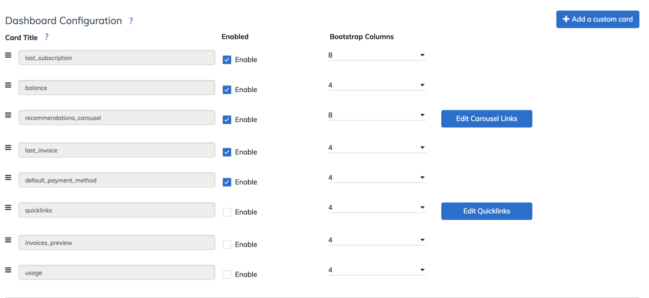
- To configure the default dashboard cards:
- Enable the cards to be displayed in the portal.
- Click the
 icon to drag and drop the card tiles in the desired order to rearrange the display order of the cards. The first card will be displayed on the top left section of the page with the subsequent cards filling into the right until a new row is needed.
 - Select the value in the Bootstrap Columns dropdown list for each card. The size of a card is determined by the selected number. The Bootstrap framework uses a grid system where 12 columns are evenly split across the UI and appropriately scale to the browser size. See Example of Configuring Bootstrap Columns to understand how this configuration is used.
- To create a new card, click + Add a custom card. A new card is created at the bottom of the Dashboard Configuration section.
- Enter the Card Title, select the Enable checkbox, and select the number in Bootstrap Columns for the new card.
- Click Configure. The Configure Custom Card dialog opens.
- Enter the Javascript code and Markup HTML code respectively. For details on customizing custom panels, see Example of Configuring Custom Panels for more information.
- Click Done.
- To configure additional dashboard details:
- Click Edit Carousel Links to upload marketing images that can be linked to the desired pages relevant to your company. Up to 6 images can be uploaded and all will be cycled through on the dashboard in the order that is listed.
Note that if a card is enabled, the carousel will cycle through all of the images regardless of if they have been changed from the default. If you have only two images, it is recommended that you fill up all image placeholders by alternating two images to ensure no default images are displayed.
If no hyperlink is associated with the image, the image will be displayed but it will not redirect to other pages when end users click the marketing images displayed in the portal dashboard. Up to 6 images can be uploaded.
- Click Edit Quicklinks to enter important links for your business. You can add up to 4 links.
- Click Edit Carousel Links to upload marketing images that can be linked to the desired pages relevant to your company. Up to 6 images can be uploaded and all will be cycled through on the dashboard in the order that is listed.
- To configure the default dashboard cards:
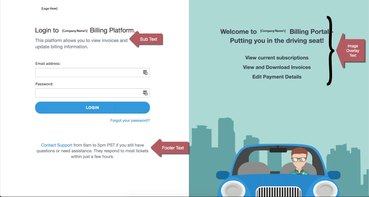
- In the Login and Site Entry page HTML section, enter the text to be displayed on the portal login page:
- Subtext - The descriptive text with the HTML formatting to be displayed under the login page logo.
- Entry Footer Text - The descriptive text with the HTML formatting to be displayed under the end user login information.
- Image Overlay Text - The descriptive text with the HTML formatting to be superimposed on the login page marketing image.
- Enter the plain text or HTML for the footer in the Configure Your Footer HTML text box. The footer will be displayed at the bottom of all portal pages. Only the HTML and Javascript are supported.
- Complete the email templates for the new user invitation, new account confirmation, and password reset respectively.
- Select the desired email template to configure from the dropdown list.

- Configure the body, footer, and header of your email template respectively. You can enter either plain text or HTML in these text boxes. See Example of Configuring Email Templates for an example of the configured email template.
- Enter the subject line of your email in the Subject field.
- Select the desired email template to configure from the dropdown list.
- Submit a ticket at Zuora Global Support to change the "from" address to the address of your organization. If this address is not changed, all future emails to end subscribers will be sent out from support@connect.com. This would create confusion for end subscribers and support issues for your organization.
- Click Save Settings to save the configurations.


Example of Configuring Bootstrap Columns
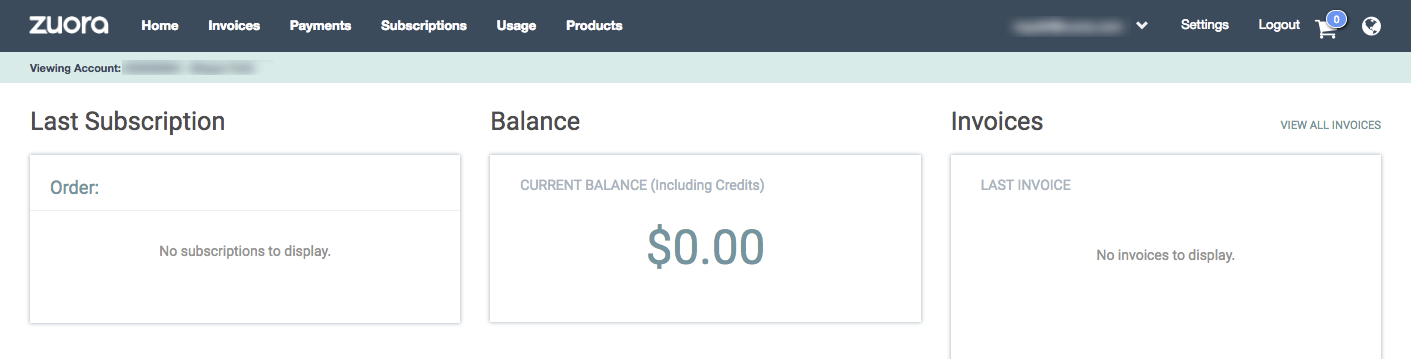
In the scenario where you want to display the last subscription, balance, and last invoice information in the top row of the dashboard, you need to enable the last_subscription, balance, and last_invoice cards, and arrange the cards in the desired order to be displayed on the dashboard. Because each row contains 12 columns and 3 cards should be displayed in the row, each card should use 4 columns.
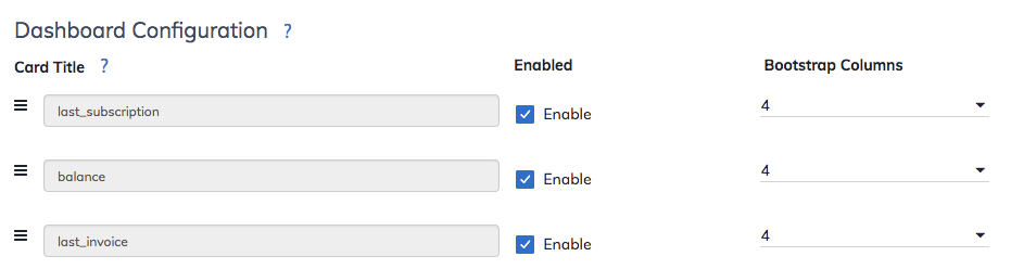
The dashboard in the portal will be displayed as:
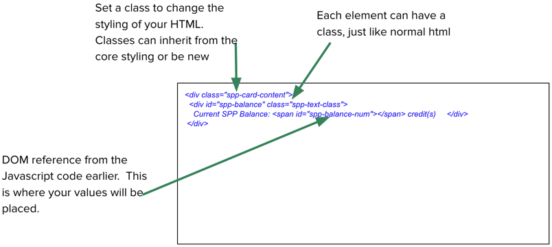
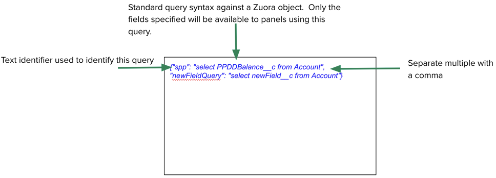
Example of Configuring Custom Panels
Custom panels enable you to present the data specific to your company to your customers. Take the following steps to configure custom panels:
- Configure Endpoints. Endpoints are queries against Zuora objects with an identifier that can be used when retrieving data from Zuora.

- Use Javascript or Vue.js to make a call to Zuora using your endpoint, and perform the required business logic before presenting to users.
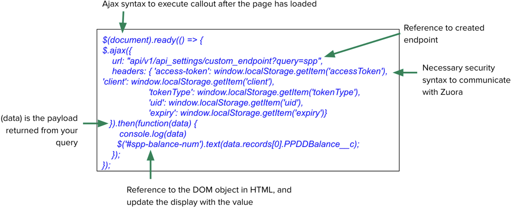
- Add HTML in the panel to control how the queried data is displayed to the user. This section can include new styles or inherit styles from the previously created CSS in the Override Default CSS Section.


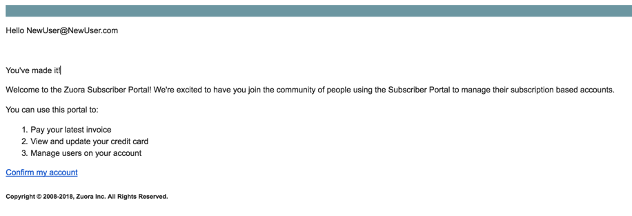
Example of Configuring Email Templates
Email templates can be configured using plain text or HTML. For example, if you want to provide a list in your message to the customer, you could add the following code snippets to the <body> section of your email template:
<p> </p> <p>You've made it!</p> <p>Welcome to the Zuora Subscriber Portal! We're excited to have <span class="il">you</span> join the community of people using the Subscriber Portal to manage their subscription based accounts.</p> <p>You can use this portal to:</p> <ol> <li>Pay your latest invoice</li> <li>View and update your credit card</li> <li>Manage users on your account</li> </ol>
The sample email based on the above configuration would be:
The limitations of the email template include:
- Hello NewUser@NewUser.com: This portion of the email template is currently not modifiable and will be displayed below the heading of each sent email.
- Confirm my account: This link is used to direct customers back to the portal. This portion of the email is currently not modifiable and will be displayed above the footer of each sent email.