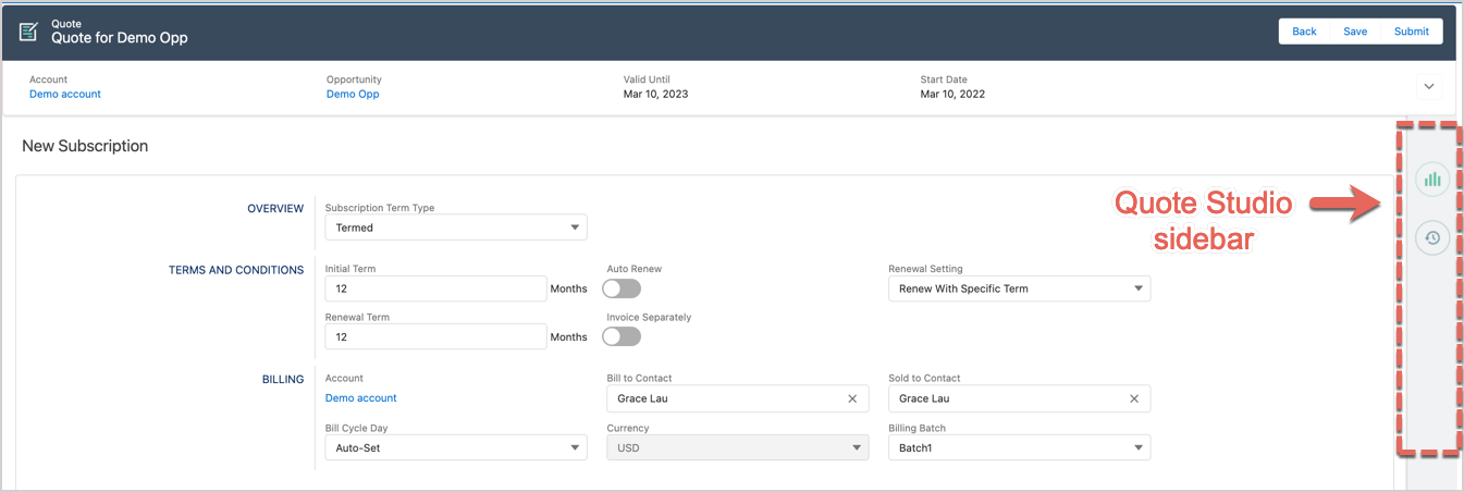
Customize Quote Studio sidebar with Extensibility Framework
Lightning web components (LWC) and Aura components are the two Salesforce programming models, based on which you can build Lightning components. LWC and Aura components can coexist in an app and interoperate with each other.
The CPQ X Extensibility Framework feature enables you to easily include your own LWC or Aura components in the Quote Studio sidebar. It can significantly improve the extensibility and usability of Quote Studio.
The high-level steps to customize Quote Studio sidebar are:
See the sections below for more information.
Create your own components
You must create your own Lightning web components or Aura components. See the following Salesforce documentation for steps about creating LWC or Aura components:
When creating components, you must ensure your component implementation meets the following requirements:
- The
pageState,metricState,quoteState,parentQuoteStateandtextTitleattributes must be declared as global attributes.Component type Code example LWC @api quoteState;
@api metricState;
@api pageState;
@api parentQuoteState;
@api textTitleAura <aura:attribute name="quoteState" type="Map" access="global" />
<aura:attribute name="metricState" type="Map" access="global"/>
<aura:attribute name="pageState" type="Map" access="global"/>
<aura:attribute name="parentQuoteState" type="Map" access="global"/>
<aura:attribute name="textTitle" type="String" access="global"/>
- Custom components must be declared globally or exposed.
Component type Code example LWC In LWC metadata file: <isExposed>true</isExposed>Aura <aura:component access="GLOBAL">
- To persist any data changes within the Quote Studio page, the following events should be dispatched with the listed parameters:
Event type Paramemeter Parameter type Description updateQuote quote Javascript object Overrides the existing quote with the parameter value and recalculates ramp intervals , and terms and conditions if necessary. A Preview an order call is initiated unless the Enable Preview On Demand Quote Studio admin setting is enabled. upsertQuoteLineItems quoteLineItems Javascript object Override existing list of quote line items with the parameter value. A Preview an order call is initiated unless the Enable Preview On Demand Quote Studio admin setting is enabled. addQuoteLinesItems - prodIds: a list of productRatePlan ids with one-time flat-fee charges
- effectiveDate
- prodIds: List
- effectiveDate: String
Add the one-time flat fee charges associated with the prodIds parameter as line items to the quote as of the effective date. A Preview an order call is initiated unless the Enable Preview On Demand Quote Studio admin setting is enabled. addProducts - prodIds: a list of productRatePlan ids
- effectiveDate
- prodIds: List
- effectiveDate: String
Adds the product rate plans listed in the prodIds parameter to the quote subscription as of effectiveDate. A Preview an order call is initiated unless the Enable Preview On Demand Quote Studio admin setting is enabled. updateProducts productTimelines Javascript object Overrides the existing productTimelines list with the parameter value. A Preview an order call is initiated unless the Enable Preview On Demand Quote Studio admin setting is enabled.
Note: This method does not initiate any recalculation of the fields on the product. The custom component is responsible for recalculating the associated fields such as Effective Price and Discount, if you manually change these field values.
previewQuoteState N/A N/A Initiates a Preview an order call. saveQuote N/A N/A Saves the existing quote and triggers a Preview an order call. toastMessageDisplay - message
- theme: the value can be
warning,error, orsuccess. - timeout: optional, defaults to 5000
- message: String
- theme: String
- timeout: Integer
Shows a toast message defined by the parameters.
Register and dispatch events
After your component is implemented, you need to register and dispatch events in your code implementation. See the following Salesforce documentation for instructions:
- For Aura components, see Fire Component Events.
- For LWC, see Create and Dispatch Events.
Aura example
If you want to register the updateQuote event for an Aura component, you can use the following sample codes:
<aura:registerEvent name="updateQuote" type="zqu:quoteUpdate"/>
Then use the following code to fire the event:
let quote = component.get("v.quoteState.quote");
let updateQuote = cmp.getEvent("updateQuote");
updateQuote.setParams({ quote: quote });
updateQuote.fire();
LWC example
When dispatching custom events in LWC, it is important to adhere to the standard of using all lowercase letters for event names. Uppercase letters are not allowed in custom event names as per LWC guidelines. Here's an example to illustrate this:
const updateQuote = new CustomEvent('updatequote', {
    detail: { quote: this.quoteState.quote },
  });
  this.dispatchEvent(updateQuote);
Register custom component in CPQ X
After you have completed the code implementation of your components, you must register your components in CPQ X so that the custom UI components are rendered in the Quote Studio sidebar.
Take the following steps to register a custom component in CPQ X:
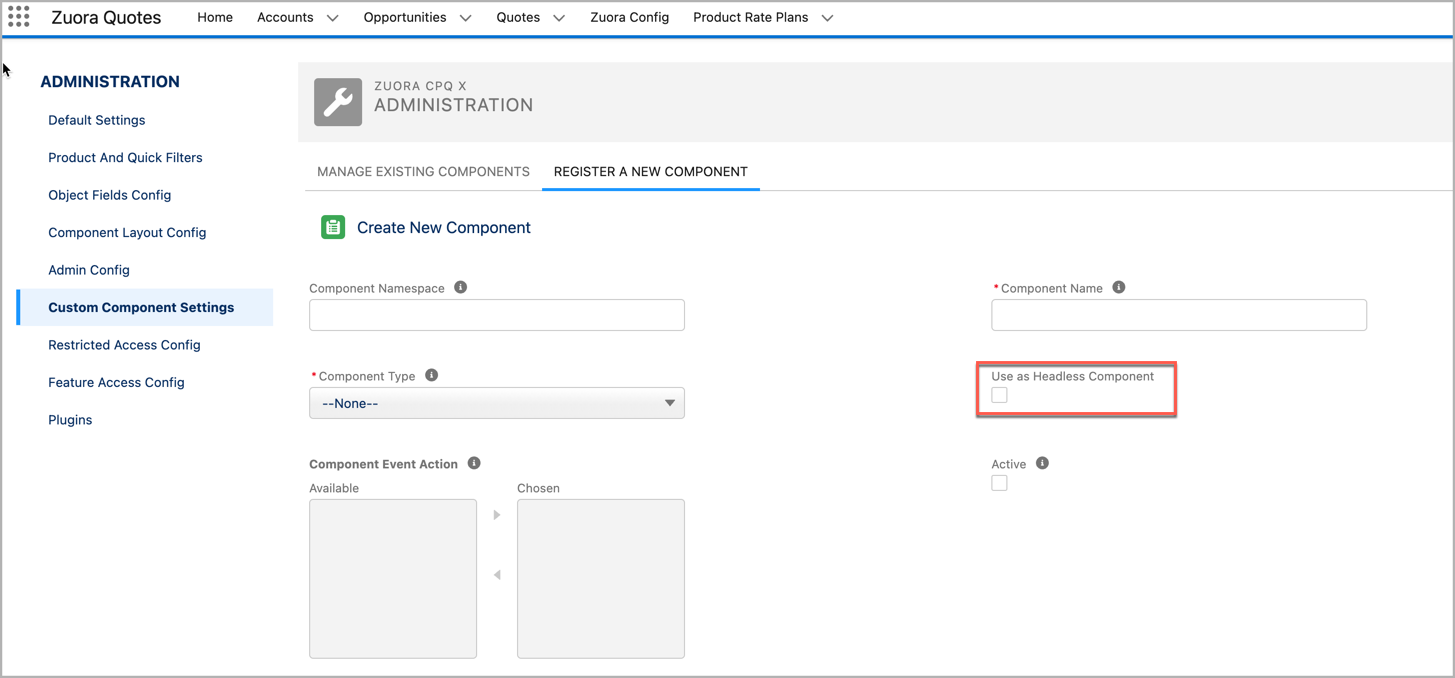
- Navigate to Zuora Config > Quote Studio Settings > Custom Component Settings.
- Click the Create New Component button.
- Complete the component information for registration.
- (Optional) Component Namespace: Enter the namespace of your component.
- Component Name: Enter the name of the component.
- Component Type: Select Aura or LWC from the dropdown lists.
- (Optional) Component Event Action: Select the event actions you want to handle in your component.
- (Optional) Use as Headless Component: Check this box to designate the component as headless. (Headless Components will not appear in the Quote Studio Sidebar)
- Active: Select this check box if you want to activate the registered component on registration.
- Sort Order: Enter the number of the sequence number such as
1. The registered components are sorted and displayed in the ascending order based on the Sort Order value. - (Optional) Title Text: The title text for the registered component.
- Image Resource Name: Enter the name of your component. It should be identical with the name of the image file that is uploaded to static resource in Salesforce.
- Click Create.
If the created component is added to the table in the Manage Existing Components tab, the component is successfully registered.
Update display order of custom components
If you have registered multiple custom components, you can customize the display order of these components.
Take the following steps to update the display order of registered components:
- Navigate to Zuora Config > Quote Studio Settings > Custom Component Settings.
- Click the Update Order button.
- Edit the number in the Order column for different entries. The components are sorted in the ascending order of the Order value. Therefore, if you want to move a component to the top, you should specify the lowest value in the Order column for this item, and vice versa.
- Click Save to save the change.
After you updates are saved, the registered components are reorganized based on the updated Order value.
Headless Component
Headless Component expands the capabilities of our Extensibility Framework Custom Components. With this, you have the ability to trigger custom component logic upon Quote Studio events.
Form Quotes version 10.21 or later, you have the capability to designate components as “Headless Components,” which are components without a user interface (UI). These components can be harnessed to execute your extensibility framework custom component logic based on Quote Studio events, specifically Save or Submit events.
Note that only a single active Headless Component is permissible.
Create global methods for Quote Studio Events that can be executed in response to Quote Studio events. Currently, the following events are available:
- beforeSave
- beforeSubmit
- beforePreviewCall
| Method Name | Input Parameter | Return Parameter | Description |
|---|---|---|---|
| beforeSave | N/A |
Boolean (optional) (default: true) |
This will be executed upon Save Button Click in Quote Studio. Based on the returned Boolean Value Quote Studio's Save logic will get executed.
|
| beforeSubmit | N/A |
Boolean (optional) (default: true) |
This will be executed upon Submit Button Click in Quote Studio. Based on the returned Boolean Value Quote Studio's Submit logic will get executed.
|
| beforePreviewCall | N/A |
Boolean (optional) (default: true) |
This will be executed upon Preview Call in Quote Studio. (Only applicable for Preview on-demand). Based on the returned Boolean Value Quote Studio's Preview Call logic will get executed.
|
Use async / await for long-running async JS tasks
Sample code
import { LightningElement, api } from 'lwc';
export default class HeadLessComp extends LightningElement {
@api quoteState;
@api metricState;
@api pageState;
@api parentQuoteState;
sleep = (delay) => new Promise((resolve) => setTimeout(resolve, delay));
connectedCallback() {
console.log('Custom Component is Loaded,..');
this.dispatchEvent(new CustomEvent('toastmessagedisplay', {
detail: {
message: 'Custom Component is Loaded...',
theme: 'success'
}
}));
}
@api
async beforeSave() {

//Use Async / Await to dely execution - If any long running task like external API Calls to be completed and if it's response has a dependency on the logics in this method
await this.sleep(5000);

// will be executed after 5000 ms
this.dispatchEvent(new CustomEvent('toastmessagedisplay', {
detail: {
message: 'Ssve logic from Custom Component',
theme: 'error'
}
}));

this.quoteState = JSON.parse(JSON.stringify(this.quoteState));
this.quoteState.quote.Name = 'Quote Name from Custom Comp';

this.dispatchEvent(new CustomEvent('updatequote', {
detail: { quote: this.quoteState.quote }
}));

//continue Quote Studio SAVE Logic
return true;
}

@api
beforePreviewCall() {

this.dispatchEvent(new CustomEvent('toastmessagedisplay', {
detail: {
message: 'Preview Call logic from Custom Component',
theme: 'success'
}
}));

//continue Quote Studio Preview on-demand Logic
return true;
}

@api
beforeSubmit() {

this.dispatchEvent(new CustomEvent('toastmessagedisplay', {
detail: {
message: 'Submit logic from Custom Component',
theme: 'error'
}
}));

//STOP Quote Studio SUBMIT Logic
return false;
}
}