Understand your business processes
ProcessAI provides intuitive process maps and detailed process data, which allows you to easily understand your complex business processes through data visualization. With closed-loop continuous process mapping and optimization capability from ProcessAI, you can quickly analyze your business process at any point in time and get insights into how a new process impacts your business.
Key concepts
Before looking into your business processes, ensure that you understand the following concepts documented in Basic concepts of Zuora ProcessAI.
- Variant
- Case
- Process correlations
Understand process map
From the Process Discovery page, select a scenario. On the process page, click Process Map in the Analysis pane, and optionally select an existing data filter or create a new filter. Then your focus can move to the process map in the middle pane and process data on the right.
All variants (100% Variant) of your business processes are displayed as your default process map in the middle pane. Each process map consists of two basic units: activity node and KPI.

Activity node
The following types of activity nodes are available, which are indicated using different colors:
- Start: The start point of variants.
- Process: Process activities that can flow to only one activity. For example, the created, creditbalanceapplied, transferredtocreditbalance and posted nodes in the screenshot above.
- Decision: Activities that can lead to multiple activities, for example, the pdfgenerated node in the screenshot above.
- End: The end point of variants.
Each node is considered an activity or event. Click a node, and the statistics of this node are displayed in the Process Data pane.
Key Performance Indicator (KPI)
KPI determines how the process is described and measured. Based on your selection of KPI, links between two activity nodes indicate the count or time from one activity node to the next in all cases.
- When KPI is set to Count, the number between two activity nodes indicates the number of times the preceding activity is run.
- When KPI is set to Time, the number between two activity nodes indicates the mean value by default of the time taken between the two activities.
The percentage value after each KPI value indicates the proportion the activity's data takes of the overall data.
When KPI is set to Time, you can click the ![]() icon to change a different measurement method. See Change metrics in process maps for more information.
icon to change a different measurement method. See Change metrics in process maps for more information.
Check process data
To get a holistic understanding of your system processes, you need to understand the different variants, their contained cases, and correlations with time.
ProcessAI offers the following tabs in thr right pane for you to generate insights into your process data:
- Variant
- Case
- Correlations
Check variants
A process variant is a unique activity sequence from the beginning to the end of the process. You can think of variants as end-to-end use cases. This is a variation of a business process.
The table in the Variant tab shows all variants in the subscription, invoicing, payments, or revenue processes, in the descending order of total case number by default.
The following columns are available in the table:
- Variant: Displays the variant with an identifier. The identifiers are given based on the descending order of the variant percentage. For example, the variant with the highest variant percentage is Variant 1, and the variant with the second-highest variant percentage is Variant 2, and so on and so forth. Note that the Original variant is a comprehensive variant that contains all other variants.
- Variant %: Represents the ratio of the total cases of the current variant against the total cases of all variants. For example, 32.69% indicates that the cases of Variant 1 take up 32.69% of total cases in the system that are processed.
- Total cases: Indicates how many cases are created or generated for each variant.
You can select the checkbox for one of the variants, then the corresponding variant is highlighted in bold in the overall process map. See the highlighted route in the following screenshot as a variant example.

Check cases
A case represents a transaction created or generated for a specific scenario. For example, for billing processes, a case is an invoice, and the case ID is the generated invoice ID.
Click the Case tab, you can see all corresponding cases with different case IDs and the number of contained activities for this variant.
Click the case ID, then a dialog opens and displays the detailed activity information for the corresponding case:
- Activity: Activity names that correspond to activity nodes in the process map. For example, “created” means that the case is created. In the context of the billing process, it indicates the invoice creation activity.
- End Time: The completion time of the current activity.
- Start Time: The start time of the current activity.
- Total $: The total amount of transactions in the current activity.
Tips: You can also view details of the transaction by clicking the case details tab.
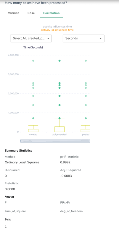
Check correlations
The Correlation tab visualizes the attributes that are impacting time. Different correlations are showcased in different colors:
- Red correlations indicate that attributes are highly correlated
- Golden correlations indicate that attributes are loosely correlated.
- Gray correlations indicate that attributes are not correlated.
Click any correlations, then the box plot is displayed if an inherent order of data points is identified, or the scatter plot is displayed if data points are discrete. The statistics summary is presented below the plot. To check the correlation between particular activities and time, you can select one or more activities from the Activity dropdown list. You can switch the time unit from the Time Unit dropdown list.
Hover over the box in the box plot, and you can check the following statistical values:
- Upper
- Upper Quartile (Q3)
- Median
- Lower Quartile (Q1)
- Lower
If outliers exist in the box plot, hover over outliers and the average time for the corresponding activity to complete is displayed.
For example, for a specific variant that has the “activity influences time” correlation statement in grey, clicking the correlation statement brings out the corresponding box plot in the screenshot below. The other statistical coefficients are showcased below the plot, allowing you have a systematic understanding of all relevant data points.