UI navigation
To get started with Zuora Revenue, it is recommended to have an understanding of the basic functionalities that are provided by its user interface.
Login screen
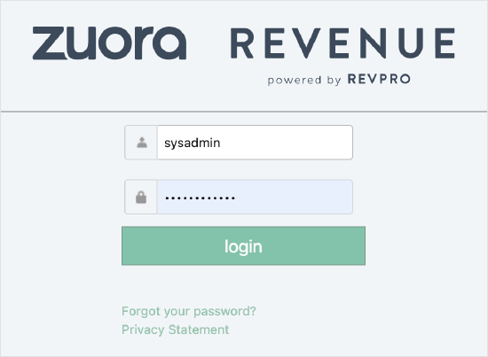
After you enter the URL to access Zuora Revenue, the login screen is displayed as shown in the following graphic. Provide your user ID and password, and then click login to log into Zuora Revenue.
If unified authentication is enabled, the login screen will look different. You will use one single URL to access all Zuora products and all instances of Zuora Revenue.
Main menu
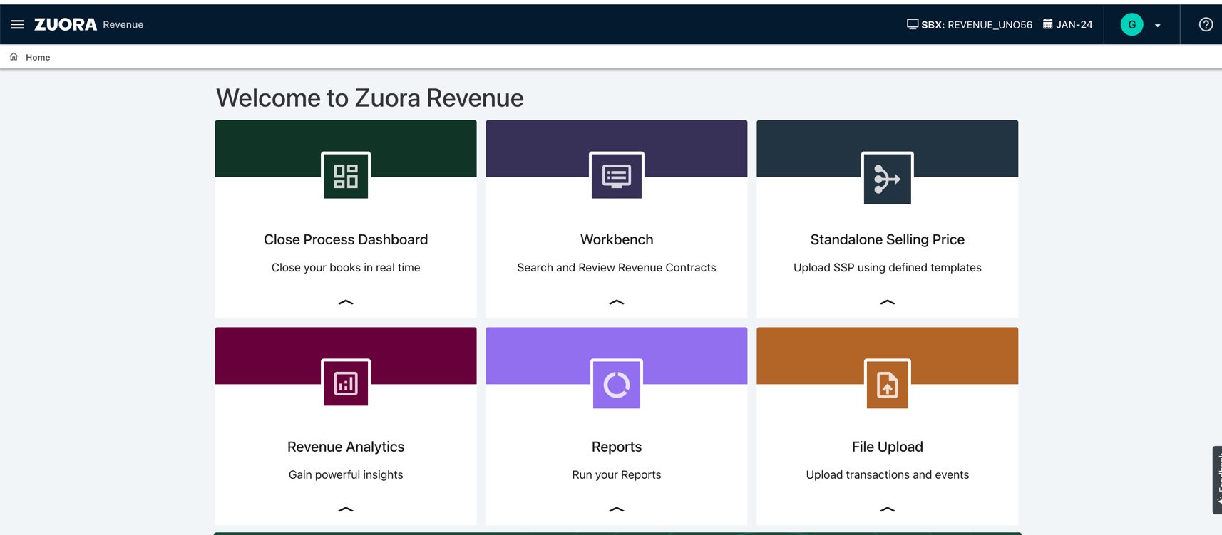
After you log into Zuora Revenue, the landing page is displayed. You can also configure the system to display the custom dashboard as your landing page. Use the main menu options to do anything with Zuora Revenue, including configuring the custom dashboard. The menu style is different for the unified and non-unified authentication users.
Non-unified authentication users
To open the main menu, click the menu icon  on the upper-left corner. The main menu as shown in the following graphic is displayed with all available options. To close the main menu, click
  on the upper-left corner.
Side menu
For the following main menu options, after you click them on the main menu, the side menu is then available to provide you with more advanced options:
- Reports > Download Reports
- Workbench > Revenue Contracts
- Accounting > Period Open/Close
- Policies > Performance Obligations
- Policies > Holds and Approvals
- Data Interface > Revenue Sync
- Setups > Application
- Setups > Security
To open the side menu, click the white left arrow  on the right side of the screen. To close the side menu, click the white right arrow
  .
.
Unified authentication users
The main menu as shown in the following graphic is displayed on the left-hand side with all available options. To collapse the main menu, click icon the upper-left corner.
Side menu
For the following main menu options, the sub menu options are available to provide you with more advanced options.
To open the sub menu, click the white arrow  on the left side of the main menu option.
- Reports > Download Reports
- Workbench > Revenue Contracts
- Accounting > Period Open/Close
- Policies > Performance Obligations
- Policies > Holds and Approvals
- Data Interface > Revenue Sync
- Setups > Application
- Setups > Security
To go back to the main menu, click on Zuora  .
.
Logout option
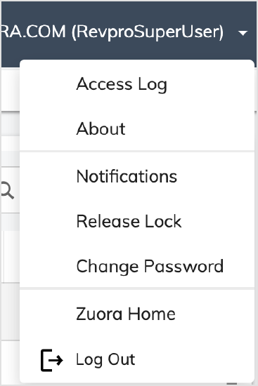
To log out of Zuora Revenue, on the upper-right corner of the screen, click your user name and then click Log Out on the dropdown list.
Navigation elements
In general, use left mouse clicks to navigate within Zuora Revenue. Hover the mouse over a table to access available buttons, icons, or tooltips.
The following navigation elements are available in Zuora Revenue. An example is also provided for each type of navigation elements.
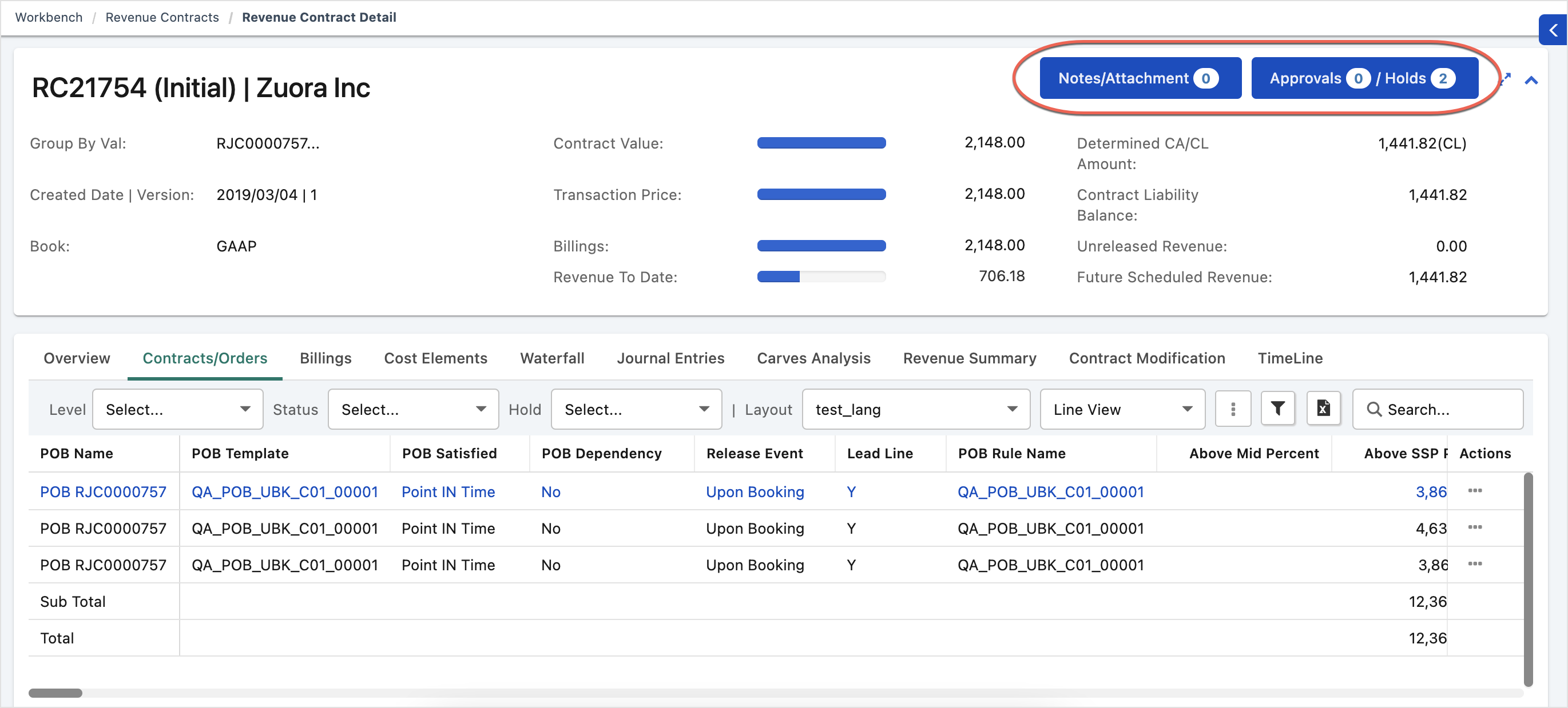
Clickable buttons
The clickable buttons are usually in the blue color, such as Notes/Attachment and Approvals/Holds, which are highlighted in red circles in the following graphic.
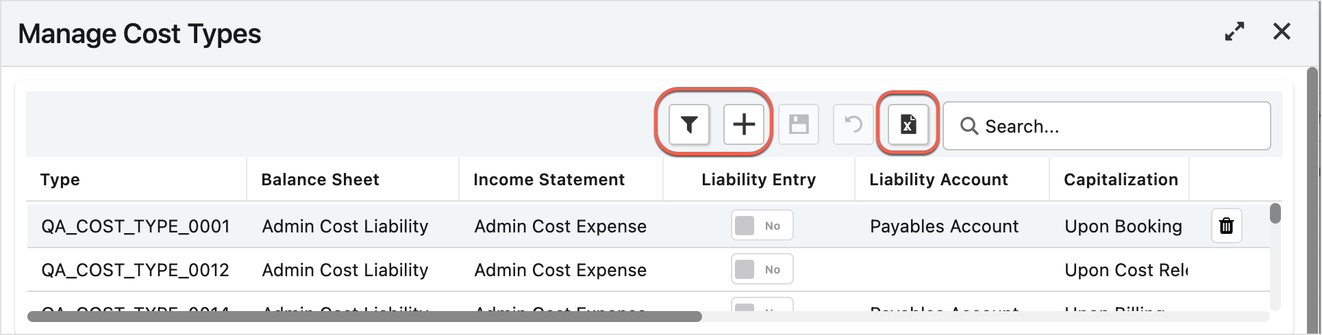
Clickable icons
The clickable icons are represented by small squares as highlighted in red squares in the following graphic. Non-clickable icons are grayed out.
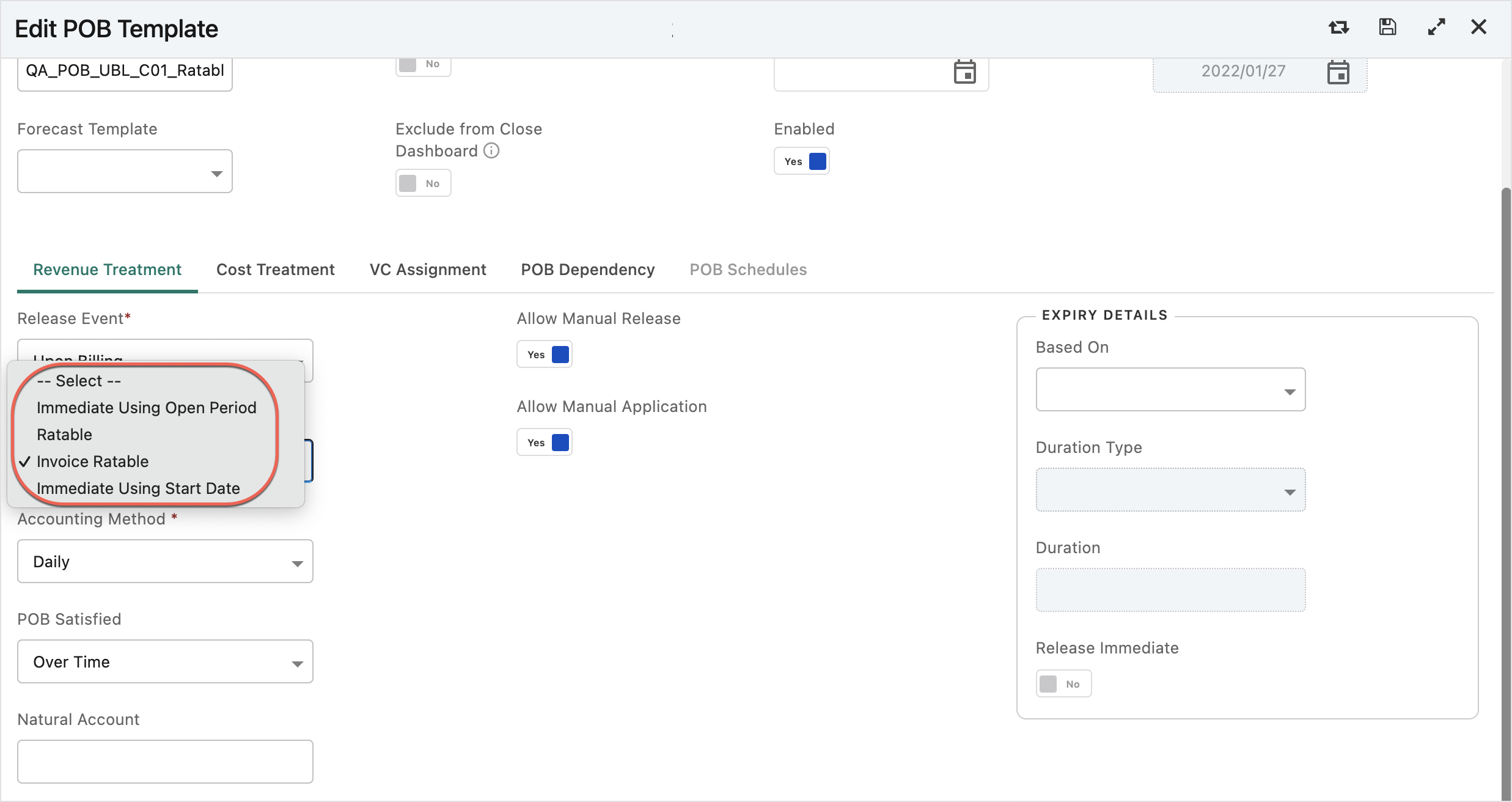
Dropdown lists
The dropdown list is displayed for your selection when you click the arrow icon. The following graphic shows an example of the Ratable Method dropdown list when you edit a POB template.
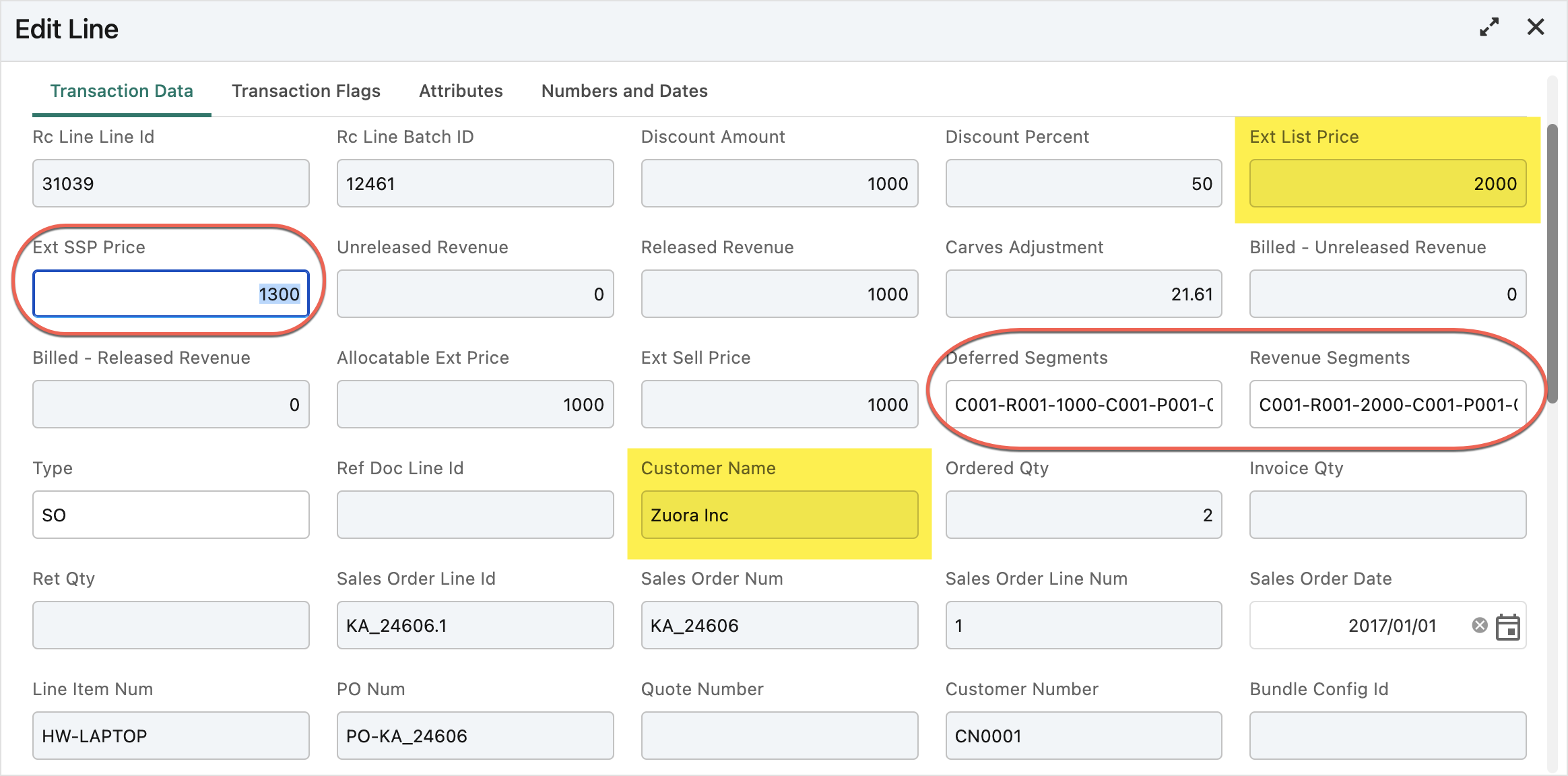
Editable and read-only data fields
You can click in the editable data field and then input the value. In the following graphic, three editable data fields are highlighted in red circles as an example, which are Ext SSP Price, Deferred Segments, and Revenue Segments.
The read-only fields are grayed out and cannot be edited. For example, the Ext List Price and Customer Name fields, as highlighted in yellow in the following graphic, are read-only and cannot be edited.
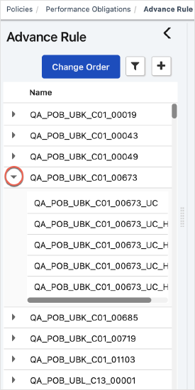
Expandable data trees
When items are collapsed in a data tree, click the arrow in front of the item name to expand or collapse the item. In the following graphic, the QA_POB_UBK_C01_00673 rule is expanded. To collapse it again, click the down arrow highlighted in red squares.
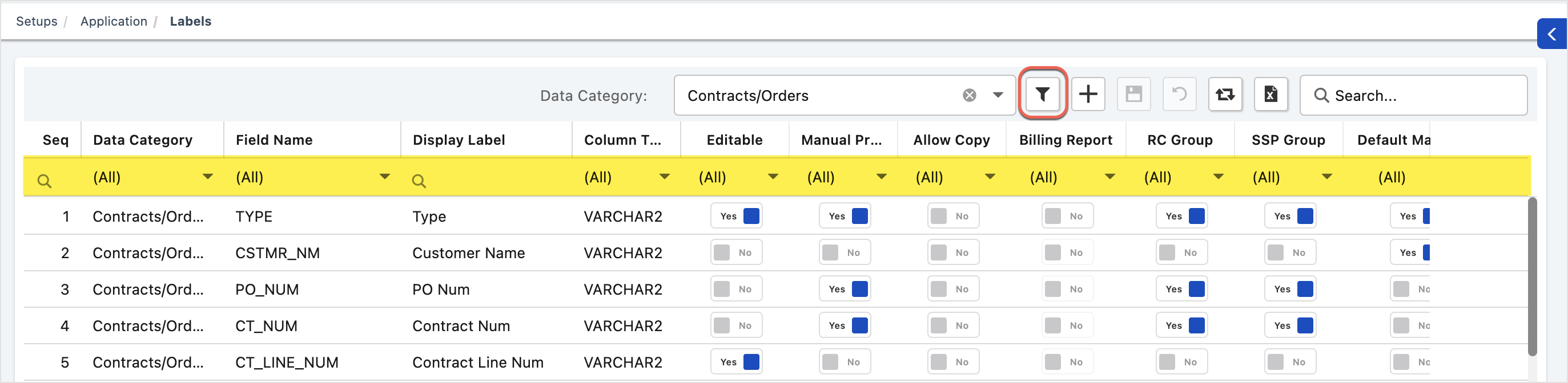
Filters
Filters are useful when you want to locate something within large tables. To display the filter row, click the Toggle Row Filter icon  . Then, input or select the value in the target column to quickly filter data. In the following graphic, the filter row highlighted in yellow is displayed after you click . To hide the filter row, click again.
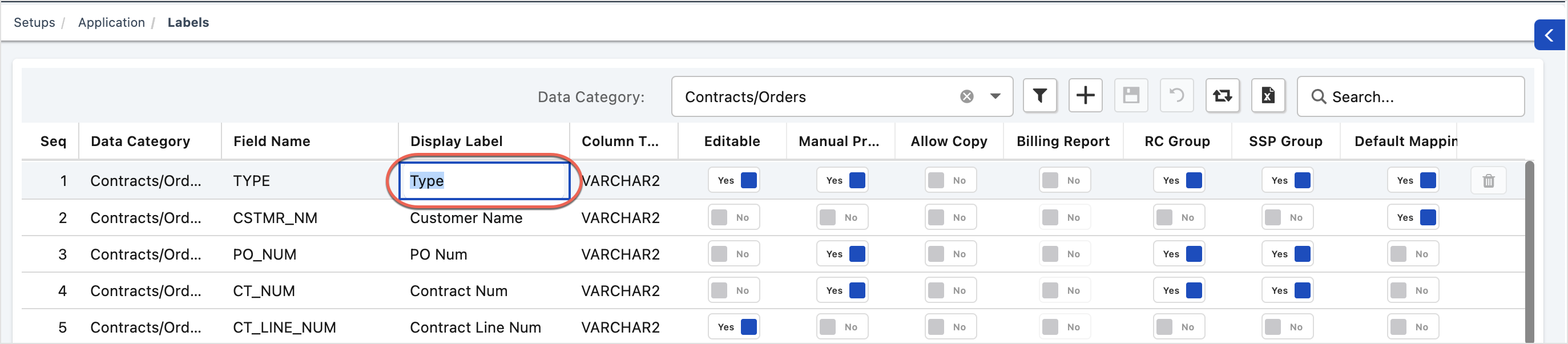
Inline editable grids
Some columns in a table are editable. To edit the value, click within the grid and then type the value. For example, to edit the Display Label value for the first row in the following graphic, click within that grid on the row.
Search boxes
Search boxes are indicated by the magnifying glass icon  . When you see a box with a magnifying glass icon, you can type the value to search in the current table.
Table slider
When a table is too large to fit on the screen, a slider is displayed on the right or at the bottom for you to scroll the table to view all data.
Table Styling
To enable alternating background colors for table rows, click the username on the top right corner to open the user profile, click Table Styling, and toggle the Alternate Row Color switch, as shown in the following graphic. This setting will display the table rows in an alternate color schema.

The table shows different background colors on single and multi-selected rows, mouse hover, and group rows.
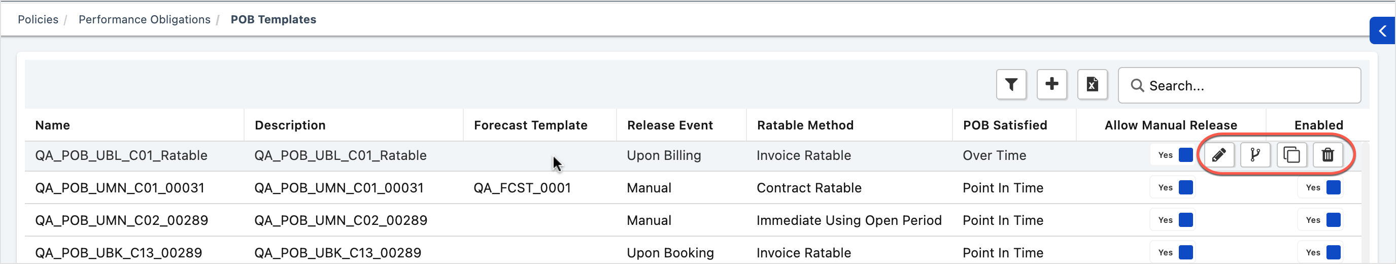
Mouse-over icons
In some tables, when you hover the mouse over a line, icons will be displayed on the right side for eligible actions that you can take on the current line. In the following graphic, when you hover the mouse over the first line, four icons as highlighted in red circles show up for you to edit, copy, or delete the line, or view the previous version of the template.
Toggle switches
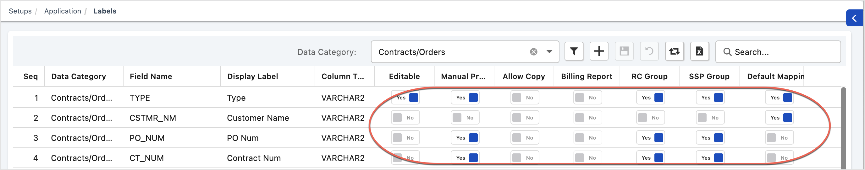
Toggle switches provide only two values for you to select. In the following graphic, toggle switches are highlighted in red circles. You can choose either Yes or No for the switch.
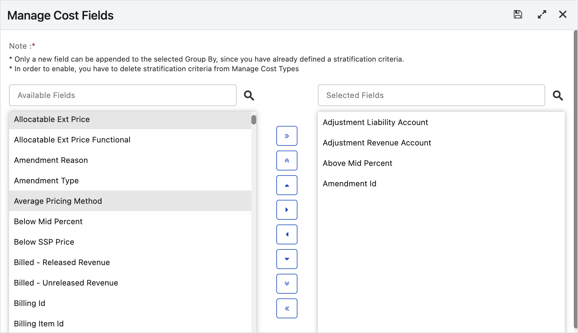
Selectable fields
During some configuration steps, you are asked to select fields from a list of all available fields. The following graphic shows an example of managing cost fields. The Available Fields section lists all fields that can be selected. The Selected Fields section lists all fields that have been selected for stratification.
- To add one or more fields for stratification, click the fields in the Available Fields section. The selected fields are highlighted in a different color, such as Allocatable Ext Price and Average Pricing Method in this example. Then, click the left arrow to move these fields to the Selected Fields section. The selected fields will be removed from the Available Fields section and added to the Selected Fields section.
- To remove one or more fields from the Selected Fields section, click the fields and then click the right arrow to move your selection to the Available Fields section.
- Use the double right arrows to move all available fields to the Selected Fields section.
- Use the double left arrows to remove all selected fields.
- Use the up and down arrows to adjust the order in the Selected Fields section.