ButtonBar Component
The ButtonBar is a lightweight global UI component that includes the following features:
- The component displays one or more buttons.
- The component can display buttons horizontally or vertically.
- The component can display simple buttons or Muttons.
The ButtonBar component is available in the Versions 6.2 and later of Zuora Quotes.
The ButtonBar component consists of:
- ButtonBar.component: The component to be embedded on Visualforce pages
- ButtonBarOptions.class: The Apex class that stores the configuration options for the ButtonBar component
ButtonBar Component Attributes
The ButtonBar component accepts the following attributes.
| Attribute | Type | Required? | Description |
|---|---|---|---|
| dir | String | Optional | The direction that displays the buttons. The default direction is horizontal. |
| options | ButtonBarOptions | Required | Configuration options for the ButtonBar component |
ButtonBarOptions Class
The ButtonBar component has the ButtonBarOptions class that provides the following property options.
| Property | Type | Description |
|---|---|---|
| barStyleClass | String | Style class of the element that contains all the button items |
| buttonItems | List<ButtonBarItem> | List of Buttons or Muttons |
ButtonBarItem Class
The following are the signatures to create a ButtonBarItem instance:
ButtonBarItem(String id, String label)ButtonBarItem(String id, zqu.MuttonOptions muttonOptions)
Sample Code
Simple ButtonBar Example
This example creates a simple ButtonBar instance with two text buttons.
The following is a sample controller code that initiates the ButtonBarOptions class:
public class ButtonBarSampleController {
   public zqu.ButtonBarOptions options {get;set;}
   public ButtonBarSampleController ()
   {
      options = new zqu.ButtonBarOptions();
      options.buttonItems = new List<zqu.ButtonBarOptions.ButtonBarItem>();
      zqu.ButtonBarOptions.ButtonBarItem item1 = new zqu.ButtonBarOptions.ButtonBarItem('but1id', 'Test Button1');
      Options.buttonItems.add(item1);
      zqu.ButtonBarOptions.ButtonBarItem item2 = new zqu.ButtonBarOptions.ButtonBarItem('but2id', 'Test Button2');
      Options.buttonItems.add(item2);
   }
}
The following is a sample Visualforce page code that includes the ButtonBar component. Run the code to render a ButtonBar component instance as shown below.
<apex:page controller="ButtonBarSampleController">
   <zqu:ButtonBar options="{!options}" dir="h" />
</apex:page> 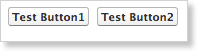
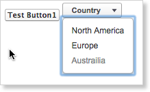
ButtonBar with a Mutton Example
This example creates a ButtonBar instance with one Mutton and a one text button.
The following is a sample controller code that initiates the ButtonBarOptions class with one Mutton and one text button. The Mutton will list three options for continents.
public class ButtonBarSampleController {
   public zqu.ButtonBarOptions options {get;set;}
   public ButtonBarSampleController ()
   {
      options = new zqu.ButtonBarOptions();

      zqu.MuttonOptions moptions1 = new zqu.MuttonOptions();
      moptions1.title = 'Country';
      moptions1.selectOptions = new List<SelectOption> {
            new SelectOption('NA', 'North America', false),
            new SelectOption('EU', 'Europe', false),
            new SelectOption('AU', 'Austrailia', true)};

      options.buttonItems = new List<zqu.ButtonBarOptions.ButtonBarItem>();
      zqu.ButtonBarOptions.ButtonBarItem item1 = new zqu.ButtonBarOptions.ButtonBarItem('but1id', 'Test Button1');
      Options.buttonItems.add(item1);
      zqu.ButtonBarOptions.ButtonBarItem item2 = new zqu.ButtonBarOptions.ButtonBarItem('but2id', moptions1);
      Options.buttonItems.add(item2);
   }
}
The following is a sample Visualforce page code that includes the ButtonBar component. Run the code to render a ButtonBar component instance as shown below.
<apex:page controller="ButtonBarSampleController">
   <zqu:ButtonBar options="{!options}" dir="h" />
</apex:page>