Component Library
Our Component Library offers a versatile selection of pre-built components and flexible form builders. You can create different types of components that can be reused across feature rules. Once finalized in the library, you can seamlessly integrate them into numerous feature rules without having to recreate them from scratch for each new rule.
Currently, the following component types are available:
- External Component: Reference to external UI components that are based on HTML templates. See External Template.
- Custom Component: Build custom components from scratch, allowing you to define variables within the component. A live preview window is available for you to visualise how your component will appear on your website. See Custom Component.
- Component Templates: Create templates with predefined variables for specific components, such as footers. You can create your own components based on the templates. See Component Template.
- Legacy Registration and Data: Utilize our classic legacy forms for registration, login, password reset, data capture, and complete registration. These forms ensure backward compatibility and are accessible to clients still utilizing our legacy systems. However, Zuora strongly encourages the adoption of our new, feature-rich forms for a more user-friendly experience with the latest features.
- Payment: Incorporate payment forms to enhance your website with a seamless checkout experience. See Payment Forms.
- Subscription Change Form: Establish Subscription Change forms for paid users, enabling them to upgrade their plans seamlessly. See Subscription Change Forms.
- Contact: Subscribe to the website’s newsletters effortlessly or create various user information forms without a full registration process involving passwords. See Contact.
- Login Or Registration - Create a modern login and registration form designed for user authentication and account creation purposes. See Login, Registration and Forgot Password Forms, Data Capture Forms, and Complete Registration Forms.
- Data Capture - Gather additional information from your end users. See Data Capture.
- Account Management - Create forms for essential account-related tasks. See Account Management.
Create and manage components in Component Library
On the Component Library page, you can view the existing components. For example, a payment form component will be displayed as follows:
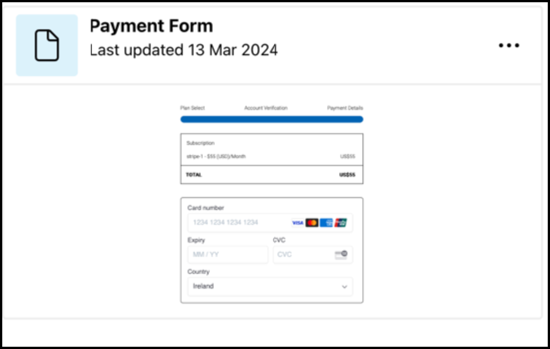
Components are listed by the last updated time. You can search for specific components using the search bar at the top of the page. Each form type is represented by a fixed thumbnail for the form type components, which means you cannot customize the thumbnail for a specific form component.
To create a component:
- Navigate to Delivery > Component Library.
- Click + Add Component.
- In the dropdown, select the component to be created. The components are classified into three sections: Forms, Components, and Account Management.
- Complete the required configurations for the selected component or form by following the below tutorials:
- Forms
- Identity
- Login and Registration Form - Allows you to create a login, registration, or a forgot password form in our modern form setup, providing innovation and flexibility.
- Contact - Allows you to effortlessly sign up for the website's newsletters or generate diverse user information forms without undergoing a complete registration process with passwords.
- Data Capture - Allows you to gather additional information from your end users.
- Complete Registration Form - Facilitates the completion of the registration process for users who have only partially registered previously.
- Legacy Registration and Data - Allows you to create a login, registration, or a forgot password form in our traditional form setup, offering familiarity and convenience.
- Payment
- Payment Forms - Allows you to add a payment form to your website.
- Subscription Change - Allows you to configure Upgrade Subscription forms for your paid users, allowing them to switch to higher-tier plans.
- Identity
- Components
- Internal
- External
- Account Management
You can create and manage the versions of a component:
- Click the component that you want to edit, or click More Action > Edit.
- On the Component Details page, you can edit or delete a version, create new versions, or set a version as the default. You can add or modify the description of versions.
Tip: Use search to find a version quickly.
You can also clone or delete a component by clicking the More Action icon of the component and then clicking Delete or Clone.
Add components to the feature rules
When adding an outcome to a feature rule, you can either:
- Import an existing component previously generated in the component library.
- Create a component on-the-fly directly within the outcome (and optionally save it in the component library afterward).
Option 1: To add a component from the Component Library:
- On the Add an Outcome or Edit an Outcome page, click + Add A Component or Form under Components or a specific component section.
- Click Component Library under Components, and then select the component from the library.
- Determine the version to be used. The default version will be automatically selected. To change to another version, turn off the Use Default Version toggle button and then select the version to be used from the version list. Note that you can preview the component from the preview window on the right-hand side. The preview window supports switching between devices and specifying screen size.
- Update values for the variables defined for the component, if applicable.
- Click Save.
Option 2: To add a component on-the-fly:
- Go to Product > Features.
- Add a new feature or select an existing one.
- Click Add a New Outcome in the Version screen.
- Click Add a Component or Form.
- Enter the required information.
For more information about how to work with feature outcomes, see Feature Outcomes.