Component Templates
Zephr allows you to create custom components from scratch, but it also provides a library of component templates that you can use directly in your feature outcomes. These templates come with predefined variables, making them easily customizable without requiring additional development effort. You can use them as-is or as a starting point to create your own components.
Getting Started with Component Templates
Before working with templates, familiarize yourself with the Custom Template Editor. See Custom Components for details on using the editor.
To create a component from a template:
- Navigate to Component Library > Add Component > Components > Component Templates.
- Select the template you want to use. These templates provide flexibility to match different content presentation needs, whether for banners, CTAs, or product pricing comparisons.
- In the Select a Component Template window, select one of the following options:
- Slim Text Banner – A minimalist banner with a single line of text, ideal for brief notifications or announcements.
- Centered CTA Banner – A centered banner featuring text, a Call to Action (CTA) button, and an optional link, making it suitable for driving user engagement.
- Combo Banner (Centered) – A combination of a Slim Text Banner and a Centered CTA Banner, allowing for both a brief message and a visually engaging section with an image, CTA, and link.
- 3-Column CTA Banner – A structured banner with three sections:
- Left: A CTA button and link
- Middle: Informational text
- Right: An image
This layout is effective for presenting a balanced mix of visuals and actionable content.
- Combo Banner (3-Column) – A hybrid banner that includes a Slim Text Banner at the top, followed by a 3-Column CTA Banner, combining concise messaging with a structured, content-rich section.
- Popup CTA Banner – A popup that contains a CTA banner, ensuring high visibility and user engagement when prompting an action.
- Product & Pricing Templates - These templates are optimized for paywalls and subscription-based models, helping users compare products and pricing plans effectively.
- Product & Pricing 1 – Ideal for showcasing multiple products in a paywall format, allowing users to compare product features side by side.
- Product & Pricing 2 – Similar to Product & Pricing 1, but includes an optional toggle feature, enabling users to switch between different product groups, for example, annual vs. monthly pricing.
- Product & Pricing 3 – Designed for a single product with multiple payment plans, enabling users to compare different pricing options, for example, monthly vs. yearly subscriptions at a glance.
- Edit the template just like a custom component. A preview window is available for real-time visualization. However, when switching tab groups and modifying a variable, the preview refreshes automatically—this is a known issue that will be improved in future updates.
- Once saved, your customized component will be accessible from the Component Library and ready to be used in feature outcomes.
Product Selection Screen Templates
For payment forms, Zephr provides Paywall component templates that let you customize and optimize product selection screens. These templates offer:
- Complete control over design with HTML, CSS, and JavaScript.
- Interactive elements such as toggles and tabbed views for grouping product types. Note that tabs and toggles do not auto-transition; users must manually switch between them.
- Predefined layouts (Paywall Layout 1, 2, and 3) that include a JS tab in the Ace Editor for additional interactivity.
Customize Product Selection Screens
- Choose from the three pre-built Paywall Layouts designed for higher conversions.
- Modify the template to match your brand’s style using HTML, CSS, and JavaScript.
- Organize variables into page-level settings (which remain consistent) and payment-option settings (specific to each plan).
- Customize the displayed text on the payment form to meet your requirements.
- Save your changes once you're happy with the final design.
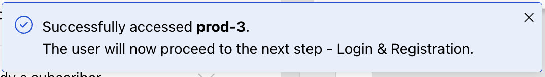
In interactive mode, toast notifications will be shown when interacting with specific elements (like buttons) in the form, to confirm the template's functionality:
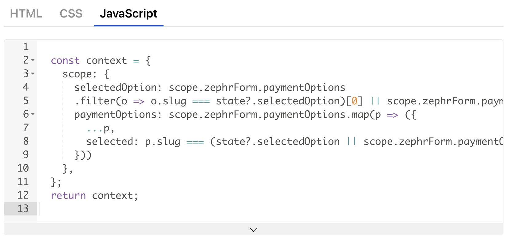
Unlike traditional Custom Components, few templates also have a JS tab in the Ace Editor, to help you implement interactivity:
You can also organise page-level vs payment-option specific variables. Group page-level variables that remain consistent across the component, and payment-option variables that are specific to each plan.
Limitations
-
Manual Tab Selection: Tabs and toggles do not auto-transition; users must manually switch between them.
-
Preview Re-Renders: When switching tab groups and modifying a variable, the preview refreshes automatically. This is a known issue that will be improved in future updates.
-
Variable Sorting: Variables in the configuration table are sorted based on the latest created variable.