Subscription Change Forms
You can configure Upgrade Subscription forms for your paid users, allowing them to switch to higher-tier plans. Upon completion of the checkout process, the current plan will be terminated, and the new plan will commence immediately.
During checkout, users will be charged a prorated subscription fee for the portion of the service period they've consumed. The remaining fee from the terminating plan will be subtracted from the new subscription fee. The following formula illustrates the checkout amount calculation:
Checkout Amount = New Subscription Fee – (Terminating Subscription Fee – Prorated Charge Fee)
When setting up the Upgrade Subscription form, you can specify which plans to display based on the user's current plan. For Stripe and Zuora Billing, you can offer new plans with longer service periods, higher prices, or a combination of both. However, with Braintree, you can only select plans with the same frequency as the current plan.
Here are some important considerations when using Upgrade Subscription forms:
- These forms are exclusively designed for upgrading and should not be shown to anonymous or registered users.
- Upgrade Subscription forms support only recurring payment options; one-off payment options cannot be added.
- When the Upgrade Subscription form is displayed, users can close it by clicking the cross icon in the upper right corner.
To customize the Change Subscription form:
- Click Add Component > Subscription Change from the Component Library screen.

By default, the Title text box is pre-filled with Change Subscription Form. You can edit this if required. You can also preview and validate your form in real-time, with updates displayed instantly in the Preview window located on the right side of the screen. - Step 1: Choose Plan - Select the Product & Payment Plan option and customize the payment options as follows:
- Modify the title of the form, if required.
- Select the required build type from the drop-down list. This selection determines whether a custom component will be utilized for the Product selection screen or if the default one will be used. The available options are Default Component and Component Library.
- Turn on the List Active Subscriptions toggle to display a list of active subscriptions in the form.
- Payment Plans Setup - Click Add a Payment Option to add a new payment plan.

- Select the required plan from the drop-down list.
- Toggle to highlight the selected plan. When selected, a Recommended row will appear over the plan.
- Change the content of the plan either directly or in HTML format, as required.
- Modify the Change Plan label to suit your preferences.
- Add a small message for the users that will be displayed below the Select Plan label as shown in the following image:

- Modify the plan label text (optional).
- Click Done to save your changes.
- Page Content Order - This refers to the initial screen displayed on a payment form. By default, this is set to the Default Component. However, if you opt for the Component Library as the Build Type, a modal will appear, enabling you to choose a custom component from your library. Once selected, this custom component will serve as the initial screen for displaying the available plans.
You can also add custom text to your form by selecting the Custom Text button.
- Step 2: Complete Purchase - Select the Payment option and customize the payment labels as follows:
- Toggle to enable or disable the progress bar in your form.

- Click the dropdown arrow at the end of the Purchase Summary and Submit Button rows.

- Change the label texts as required.
- You can also rearrange the options within the form by dragging and dropping them in the order you prefer. Any changes you make will be instantly reflected in the preview window.
- Add custom text to your form by selecting the Custom Text button.
- Add an existing user attribute to the form by selecting the User Attribute button. To add a new attribute, navigate to Identity > User Attributes > Add a User Attribute.

- Click the Section option to add sections to your form. Each section can be customized with custom text and user attributes. You can also assign a distinct name to individual sections.

- Successful Payment - You can customize the text and the options to be displayed to the users once the payment is successful.
- You can enable invitation sharing by toggling the corresponding option. This allows users to share their plans with family and friends.

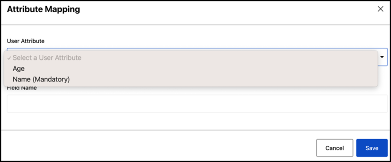
- Click Add User Attribute to add custom attributes to the form and specify the field name as needed.
- Modify the label names as required. You can also rearrange the options within the form by dragging and dropping them in the order you prefer. Any changes you make will be instantly reflected in the preview window.
- You can enable invitation sharing by toggling the corresponding option. This allows users to share their plans with family and friends.
- Click Done to save your changes.
- Toggle to enable or disable the progress bar in your form.
- Additional Settings - Click the CSS configuration and enter your preferred CSS code to tailor the form to your specifications. Click Done to save your configurations.
- Select the Save button to save your changes.