Define Your Style Guide
You can configure a style guide, which can be applied to all the forms and pages you use in Zephr. For further information on creating multi-step registration forms, see the Add an Outcome topic.
You can also define a background colour and logo for use on your pages. For further information on pages, see Pages.
To configure the style guide for your multi-step registration forms, and/or the background and logo for your pages, complete the following steps:
- Select the Style Guide button in the Add a Site screen
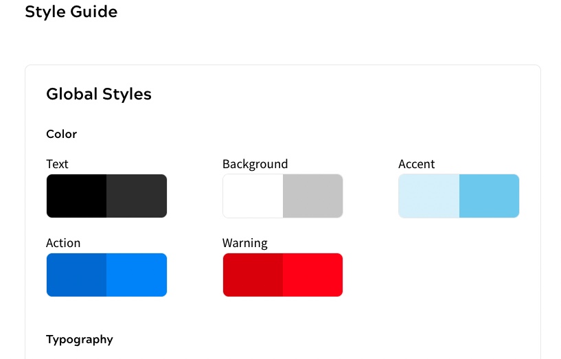
The Style Guide screen displays, as illustrated below:
Note: The page styles do not apply to third-party authentication pages. For further information on defining the styles for third-party authentication pages, see the Configure Third-party Authentication topic.
- Define the colours used in your forms in the Color section under Global Styles
Two colours are displayed for each style, these are applied as follows:
- The colour on the left is the Main colour
- The colour on the right is the Tinted colour
You can define the following colours:
- Text. This defines the colour used for titles and body text. The Main colour is applied to default text. The Tinted colour is applied to areas where a different colour of text is required, such as micro text examples in input boxes
- Background. This defines the colour used for the background in your forms and pages. The Main colour is applied to the default background. The Tinted colour is applied to inactive areas, such as an unavailable button selection
- Accent. This defines the secondary colour used to highlight areas of your form or page. The Main colour is applied to an active accent. The Tinted colour is applied when the end user hovers over the active accent area
Note: The Accent colour is reserved for future use.
- Action. This defines the colour of selectable areas, for example, buttons and hypertext links. The Main colour is applied to active areas. The Tinted colour is applied when the end user hovers over the active area
- Warning. This defines the colour of warnings. The Main colour is applied to default warnings. The Tinted colour is applied when the end user hovers over the warning
To change a colour, complete the following steps:
- Select the colour you want to change, or select the cog icon that displays when you hover over the colour you want to change
The colour selector displays, as illustrated below:
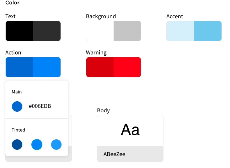
- Select the Main colour that you want to use. You can select a colour in any of the following ways:
- Enter the hex value in the text box
- Select the colour sample. The colour picker displays. You can pick a colour from the colour picker as follows:
- Select an area in the colour box
- Select the eyedropper icon to choose a colour used anywhere in your screen
- Select the colour from the colour bar
- Enter the hex value in the text box
- Select the arrows beside the text box to show the R, G and B text boxes. Enter the red, blue and green colour values in the text boxes
- Select the Tinted colour that you want to use from the options. The options are automatically generated based on the brightness level of the Main colour as follows:
- If the Main colour has a brightness equal to or greater than 90%, the Tinted colours are each 10% darker. For example, if the Main colour has a brightness of 90%, the Tinted colours have a brightness of 80%, 70% and 60%
- If the Main colour has a brightness in the range 0% to 10%, the Tinted colours are each 10% brighter. For example, if the Main colour has a brightness of 5%, the Tinted colours have a brightness of 15%, 25% and 35%
- If the Main colour has a brightness in the range 11% to 50%, one Tinted colour is 10% darker and the other two are 10% brighter. For example, if the Main colour has a brightness of 25%, the Tinted colours have a brightness of 15%, 35% and 45%
- If the Main colour has a brightness in the range 51% to 89%, two Tinted colours are 10% darker and the other one is 10% brighter. For example, if the Main colour has a brightness of 61%, the Tinted colours have a brightness of 41%, 51% and 71%
- Define the fonts used in your forms in the Typography section under Global Styles
You can define fonts for titles and body text.
To define a font, complete the following steps:
- Select the Title box to update the font for your titles, the Body box to update the body font in your forms, or select the cog icon that displays when you hover over the font you want to change
The font selector displays, as illustrated below:
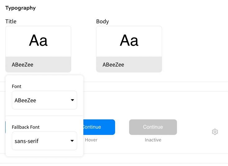
- Select the font you want to use from the Font drop-down menu
You can also enter the font name in the Font drop-down menu. The font that most closely matches the entered text automatically updates as you type.
If you are using a custom font, enter the full name of the font.
A preview of the font is shown above the font name.
Note: If you are using a custom font, or one that is unrecognised on the device, a preview cannot be displayed. Instead, the font defined as the fallback font is used in the preview.
- Select the type of font to use if the specified font is not recognised by the end user’s browser from the Fallback Font drop-down menu
When rendering the customer site, the fonts are pulled from the customer’s CSS file. The fallback font is used in the following situations:
- As the Admin Console cannot access the customer site’s CSS file, custom fonts cannot be used in the preview and the fallback font is used instead
- If the selected font is not installed on the device used to define the style guide, it is not available for use in the preview and the fallback font is used instead
- If an end user views the site, but the specified font is not recognised by their browser, the fallback font is used instead
- Select the Title box to update the font for your titles, the Body box to update the body font in your forms, or select the cog icon that displays when you hover over the font you want to change
- Define the style of the buttons used in your forms in the Button section
You can define styles for active, on-hover, and inactive buttons.
To define the style of a button, complete the following steps:
- Select the box containing the example button styles
- Select the cog icon at the right of the box
The button setting options display, as illustrated below:
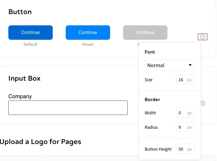
- Select the font style from the drop-down menu
- Enter the size of the font used for the button text in points in the Size text box
- Enter the width of the border, measured in point size, of the border in the Width text box
- Enter the radius of the border, measured in pixels, of the button border in the Radius text box
Note: The colour of the border is set. The active button uses the Tinted Active colour and the hover and inactive buttons use the Main Background colour.
- Enter the height, measured in pixels, of the button in the Button Height text box
- Define the style of the input boxes used in your forms in the Input box section
To define the style of an input box, complete the following steps:
- Select the box containing the example input box style
- Select the cog icon at the right of the box
The input box setting options display, as illustrated below:
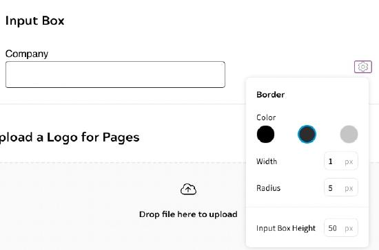
- Select the colour used for the input box border from Color swatches. The available colours are those defined for Main Text, Tinted Text and Tinted Background in the Color section
- Enter the width, measured in pixels, of the border in the Width text box
- Enter the radius, measured in pixels, of the button border in the Radius text box
- Enter the height, measured in pixels, of the button in the Input Box Height text box
Note: If you do not want to define styles for your pages, you can skip this step.
- Upload the logo used in your pages in the Logo section
To upload a logo, you can either drag a file to the drop box, or take the following steps:
- Select the Select a File to Upload button
- Navigate to your file
- Select your file
- Select the Open button
Note: If you want to change the logo, select the Upload a New Logo button, then upload a new logo as described above.
- Select the Done button to save your changes and return to the Add a Site screen
