Component Library Templates
You can create UI component templates that include customisable variables in HTML.
For further information on creating templates to your Component Library, see the Component Library topic.
You can then use these components in your feature outcomes. Each time you use a component, you can specify the values for each variable. This means that a single template can be used to create multiple outcomes.
To use a component library template in an outcome, complete the following steps:
- Navigate to the outcome in which you want to use a component library template, in either of the following ways:
- Select the outcome in your feature for which you want to display the component library template, as described in the Edit an Outcome topic
- Add a new outcome as described in the Add an Outcome topic
- Select the Add button under the Hosted UI Component heading
The Select a Template dialog box displays, as follows:
- If you have not defined any component library templates, as illustrated below:
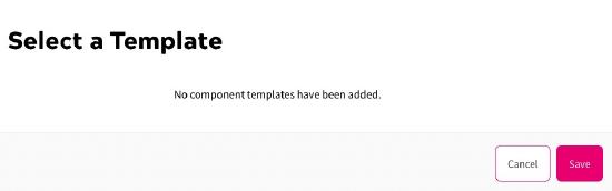
For further information on defining component library templates, see the Add a Component topic.
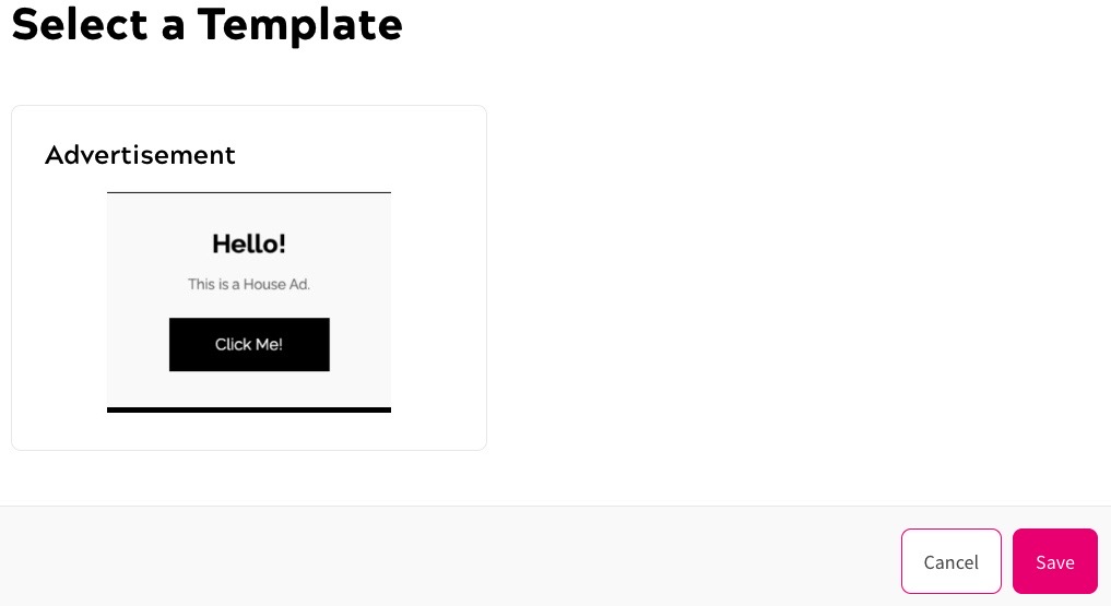
- If you have defined component library templates, as illustrated below:
- If you have not defined any component library templates, as illustrated below:
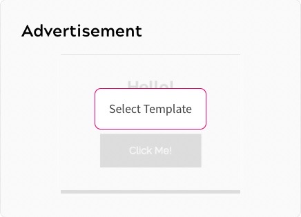
- Select the template you want to use
The Select Template button displays when you hover over the template, as illustrated below:
The Set Your Content dialog box displays. The fields in this dialog box are populated from the variables you set in the template. For further information on defining the variables, see the Add a Component topic.
For example, for the template selected above, the Set Your Content dialog box displays as illustrated below:
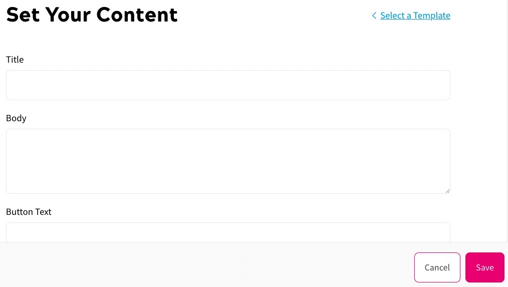
- Enter the values you want to display for each variable
- If you specified a button, you can change the background colour as follows:
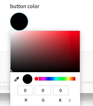
- Select the button colour swatch
The colour selector displays, as illustrated below:
- Select the colour to apply to the button background
You can select a colour in any combination of the following:
- Select an area in the colour box
- Select the eyedropper icon to choose a colour used anywhere in your screen
- Select the colour from the colour bar
- Enter the red, blue and green colour values in the R, G and B text boxes
- Select the arrows beside the RGB text boxes to use hue, saturation and lightness colour values. Enter the values in the H, S and L text boxes
- Select the arrows beside the HSL text boxes to use a hex colour value. Enter the hex value in the text box
- Select the button colour swatch
- Select the Save button to confirm the selection and return to the Add an Outcome screen. Selecting the Cancel button displays the Add an Outcome screen without saving the component